
Context
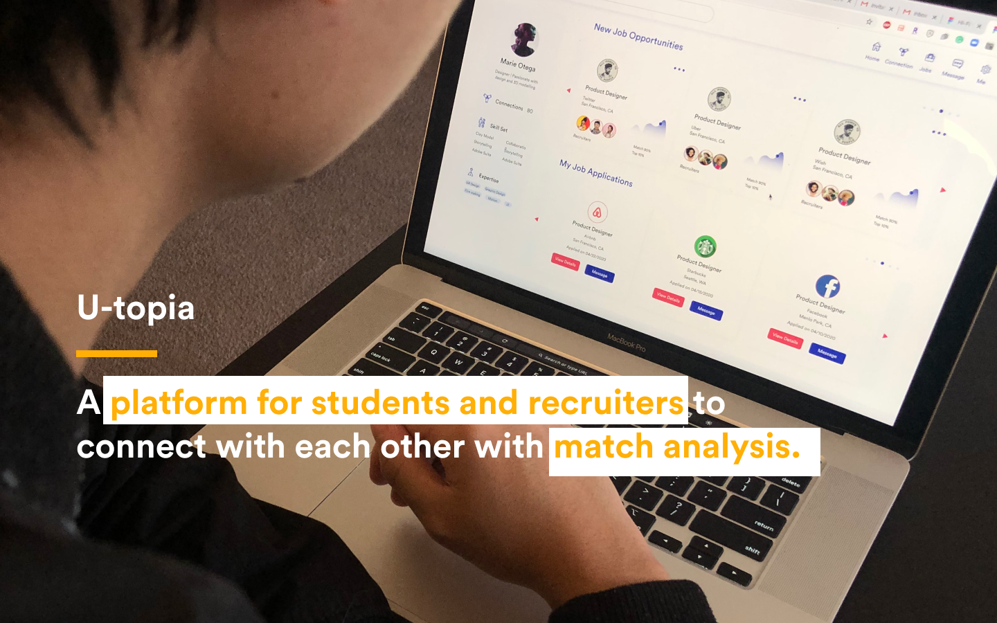
U-topia is a team project which are designed to offer a permanent platform for students and recruiters to find each other. Job hunting and hiring is a pain especially during the COVID-19 quarantine. We innovatively propose an exclusive community for students and recruiters. U-topia is the first platform that enables equal communication between students and recruiters and makes the black box of the hiring process more transparent by multiple analyses, approachable user-profiles pages, and a built-in message system.
Project Overview
Project Duration: 20 days
Team: 3 Designers
Role in the Team: Designer and researcher, brand/logo/motion designer
Skillset Applied to This Project:
User Research - Marketing Analysis, Interview, Survey, A/B Testing, Usability Testing, Data Visualization, Affinity Map
User Experience Design - Drafting, Persona & User Journey Map, Information Architecture, Wireframing & User Flow, Lo-fidelity Mock-up, Hi-fidelity Mock-up, Logo Design & Motion Design, Prototyping
Problem Statement and Project Scope
The biggest user pain points (for students) we noticed during research was the "blackbox" process of hiring, which made the communication between the student as a candidate and recruiter as a hirer extremely intransparent. This issue is more obvious in the stages of reaching out before application and follow up an application. So U-topia wants to focus on these two stages and make the experience for both sizes better.

Project Scope
How to Define User Pain Points
In order to define the true user pain points, my team did a lot of research to narrow the scope down and focus on key problems.

How Might We?
• HMW Make students and recruiters build equal and virtual connections through online platforms and job fairs?
• HMW Measure and match candidates' and recruiters' qualities and previous experiences to meet each others' expectations?
• HMW Measure and match candidates' and recruiters' qualities and previous experiences to meet each others' expectations?
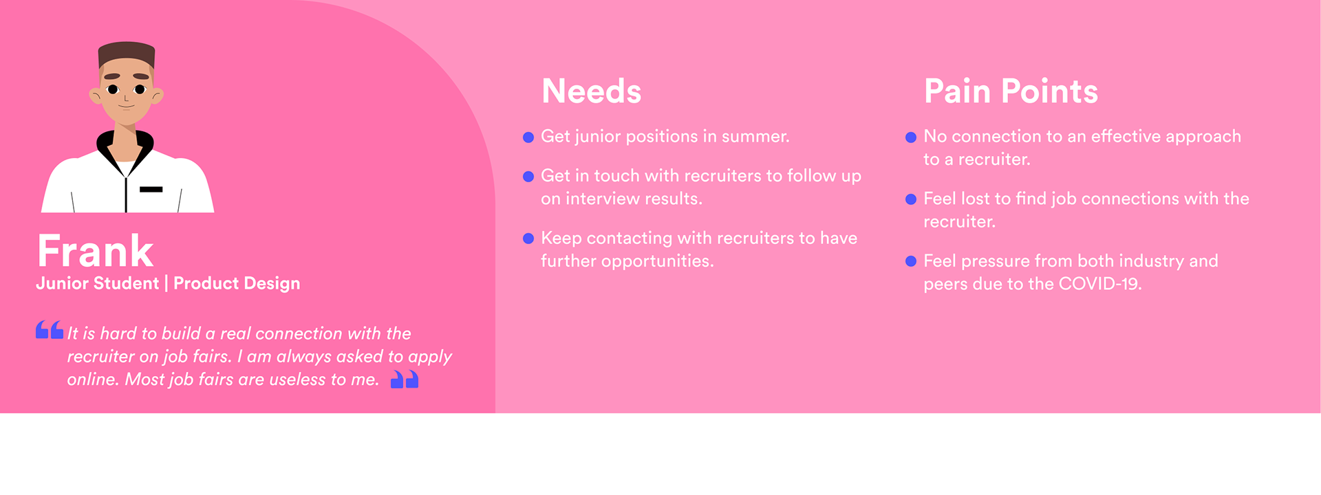
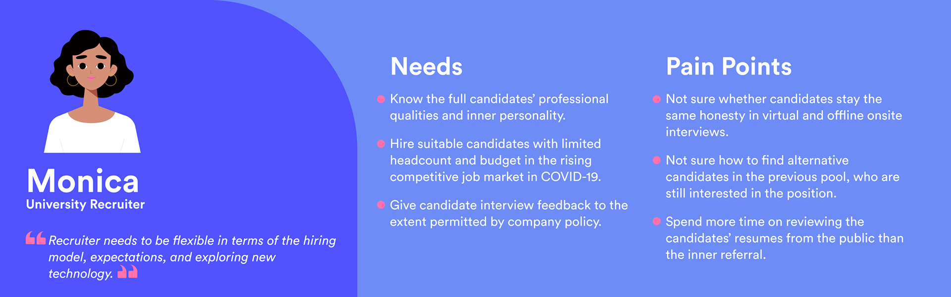
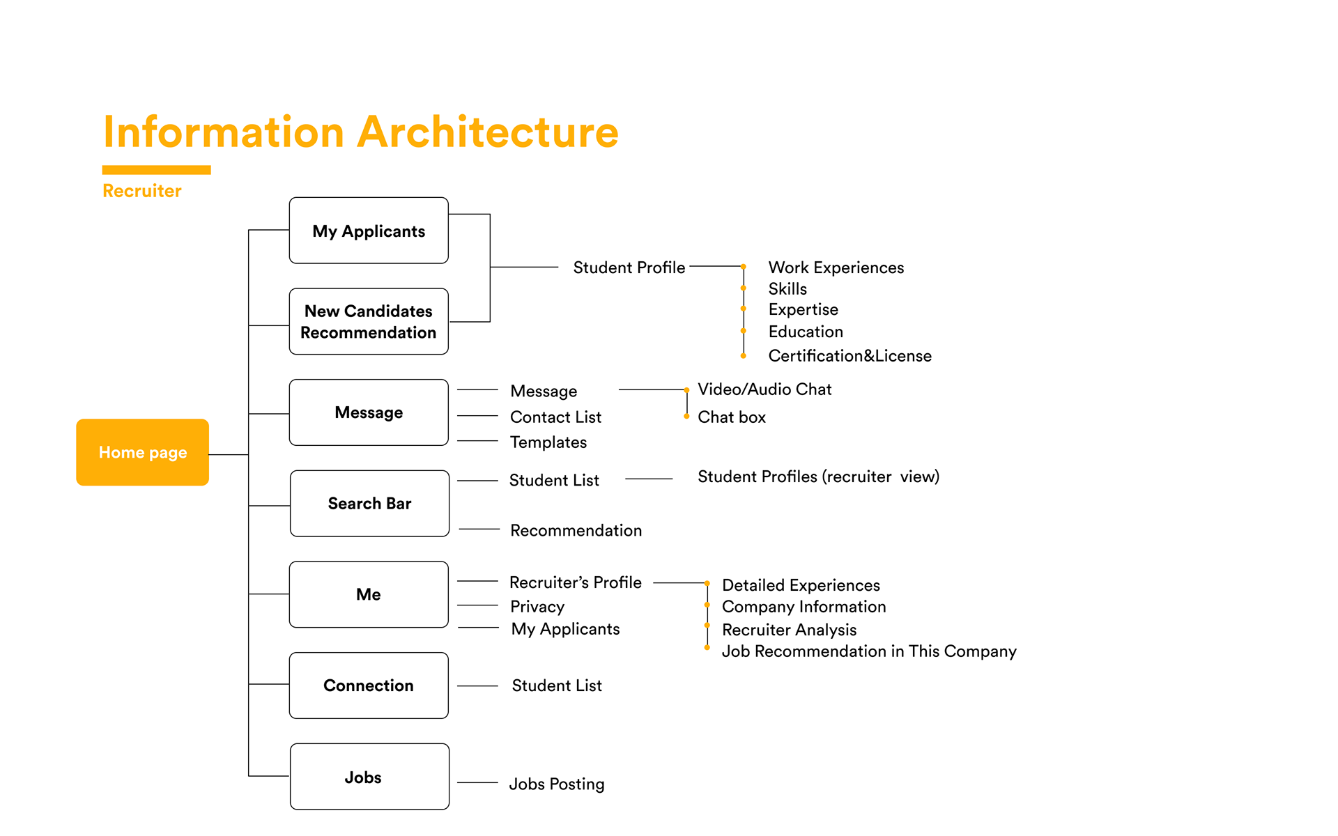
Define the User
I created two user personas to represent the two main user groups - The students, and the recruiters.
Put Myself in User's Shoes
According to the assumptions and research, the main user pain points sit in reach-out and follow-up process during a hiring process for both students and recruiters. And their emotions change vastly during the two steps.

User Journey Map - Student

User Journey Map - Recruiter
Key Features to Solve the Problem
Therefore, the structure of the whole website is built around the needs of the users.
• Direct communication and connections
• Visually driven analysis
• Equal access to new jobs and responding recruiters
• Direct communication and connections
• Visually driven analysis
• Equal access to new jobs and responding recruiters
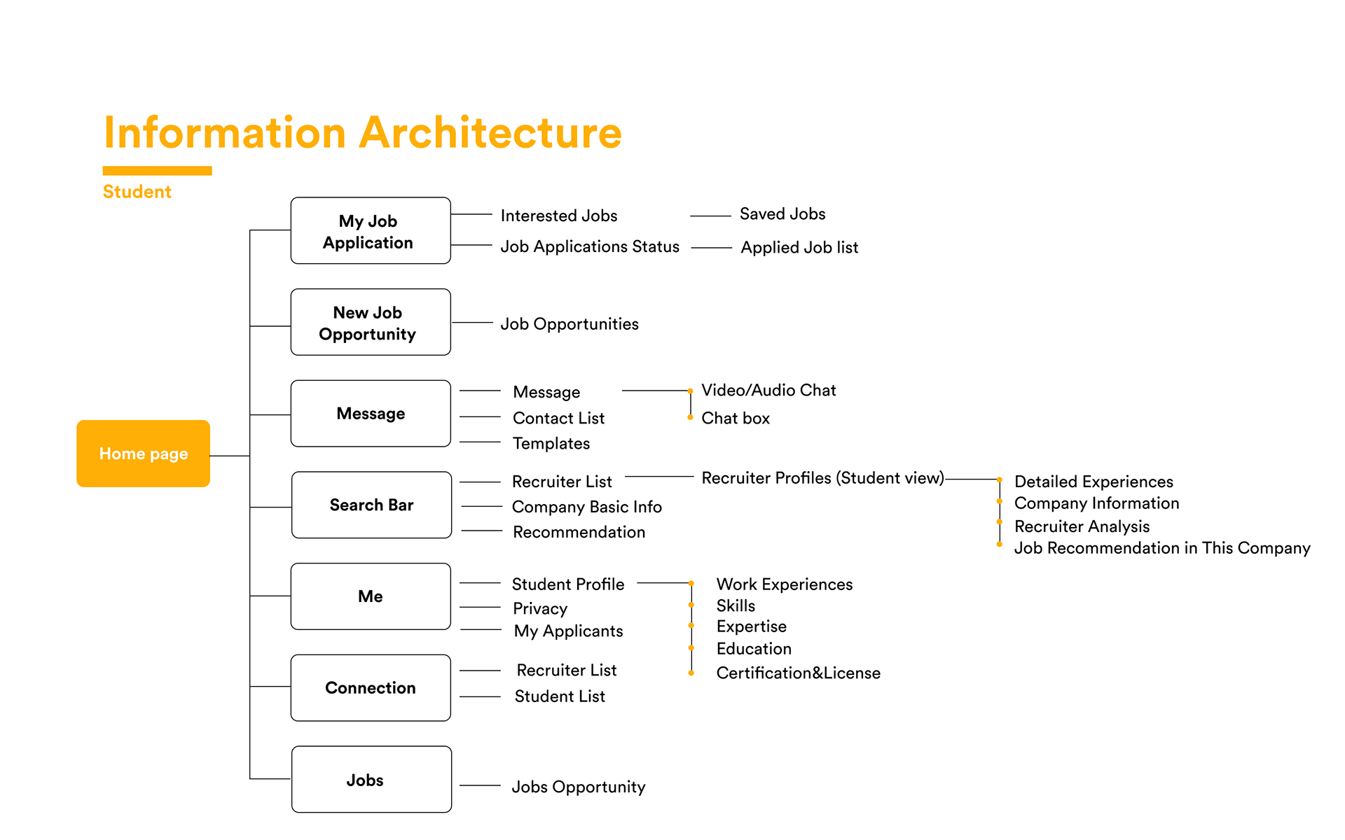
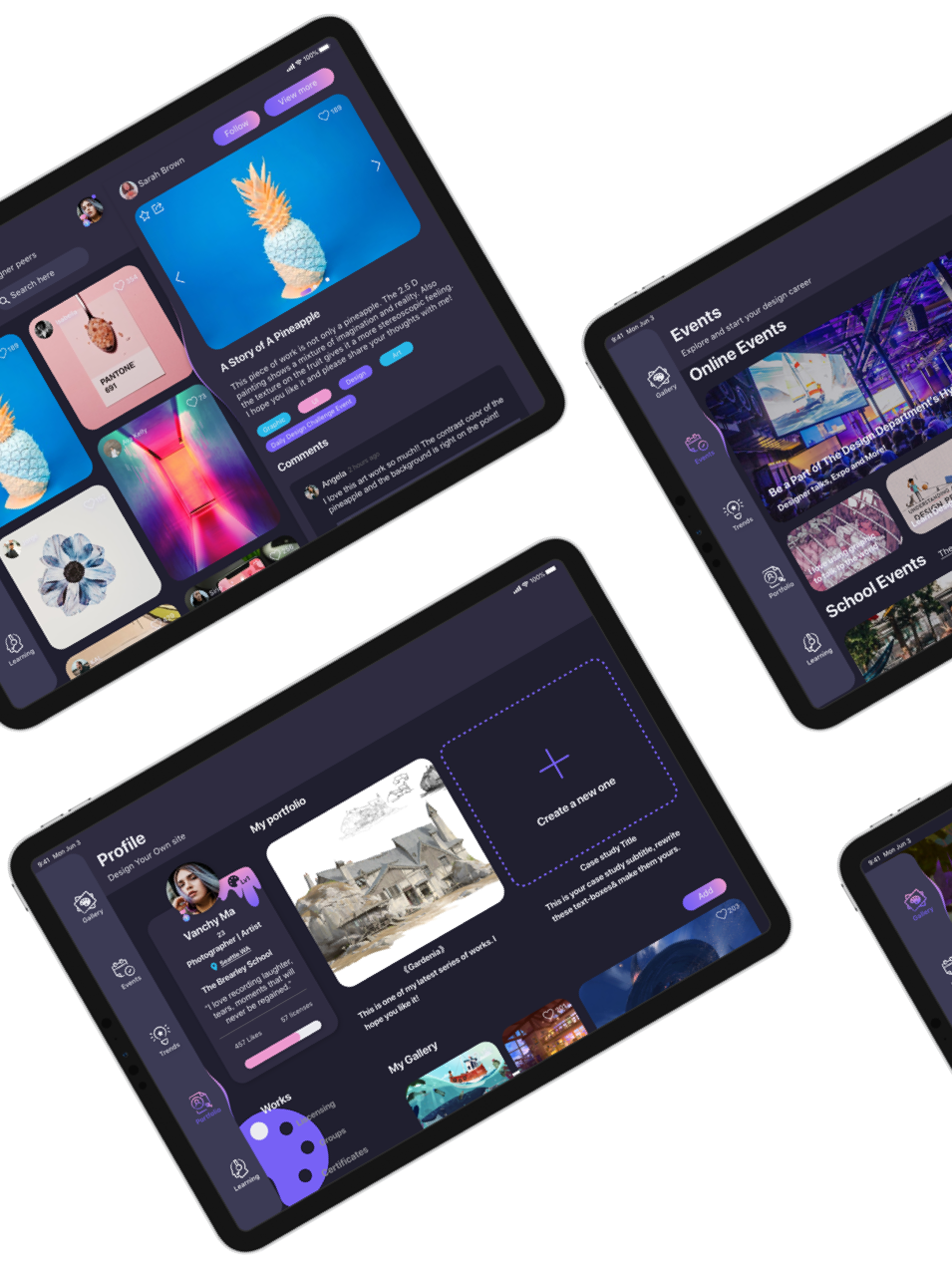
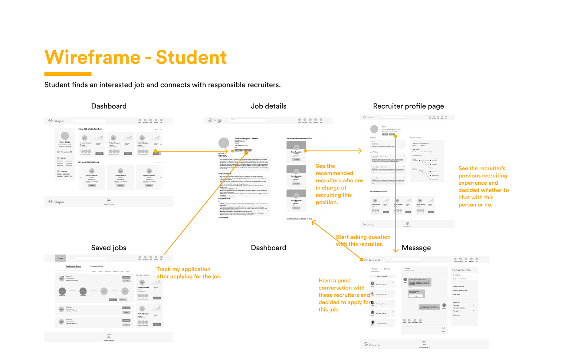
How Students Reach Out to Recruiters?
The student can find a job posting and the recruiter who is hiring both in primary places so it's not hard to locate the information. And a direct message system is available for online chat. Also, the student can view the recruiters' profile - specifically about the hiring standards and history by clicking on the recruiter's user icon.
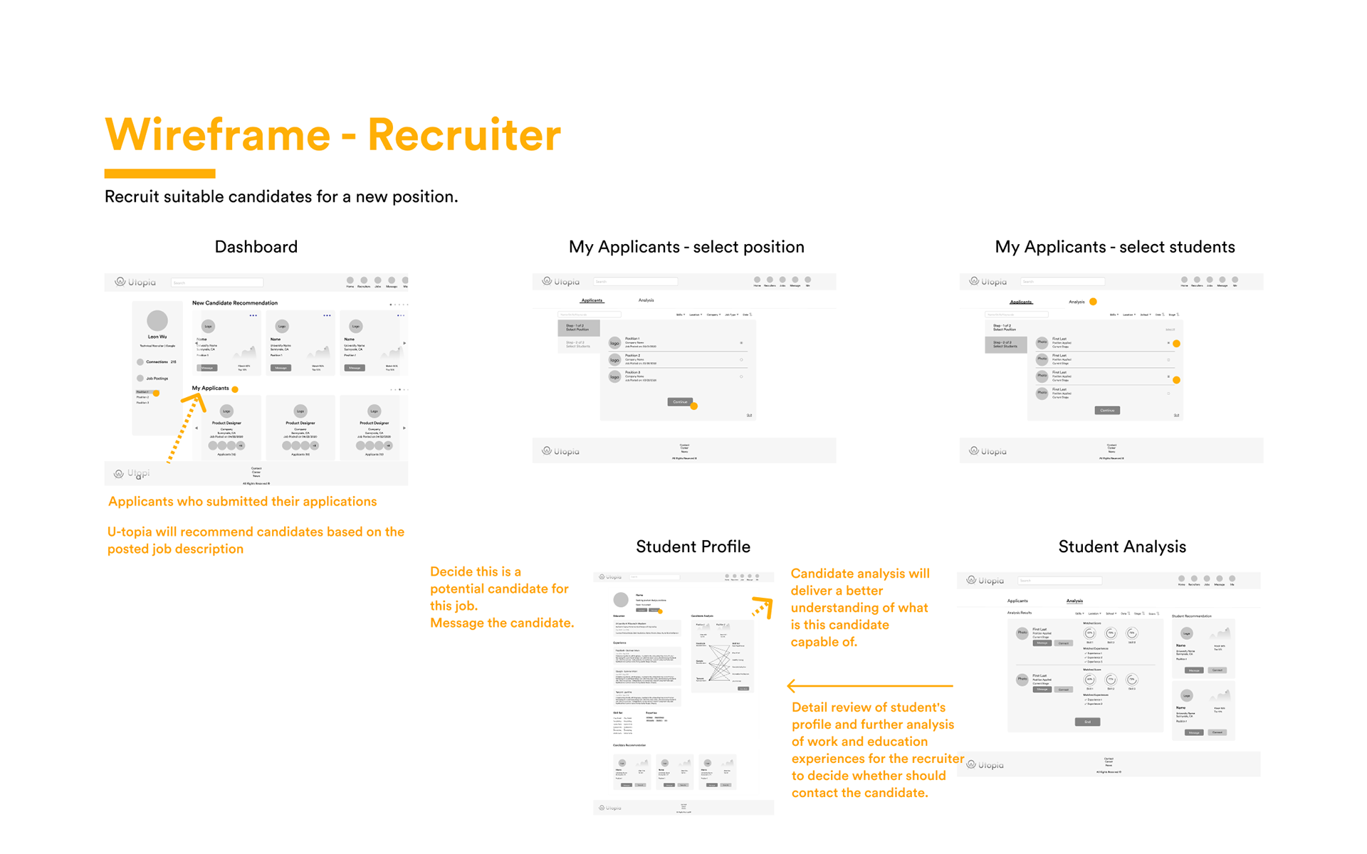
How Recruiters Find The Right Candidates?
The recruiters can manage the candidates database in the account, and see candidates applied for the jobs he/she listed. Also, the recruiter can compare multiple candidates' certain skillset simultaneously. And by checking a candidate's profile, a more detailed skill analysis is also available to view.
Style Guides Bring Design Alive
A detailed style guide is crucial to a collaborative design work.
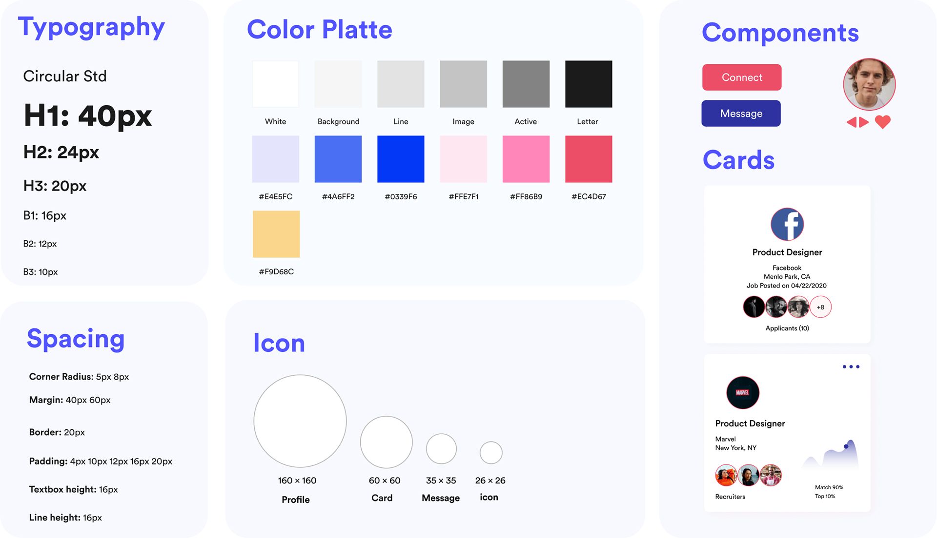
Style Guide
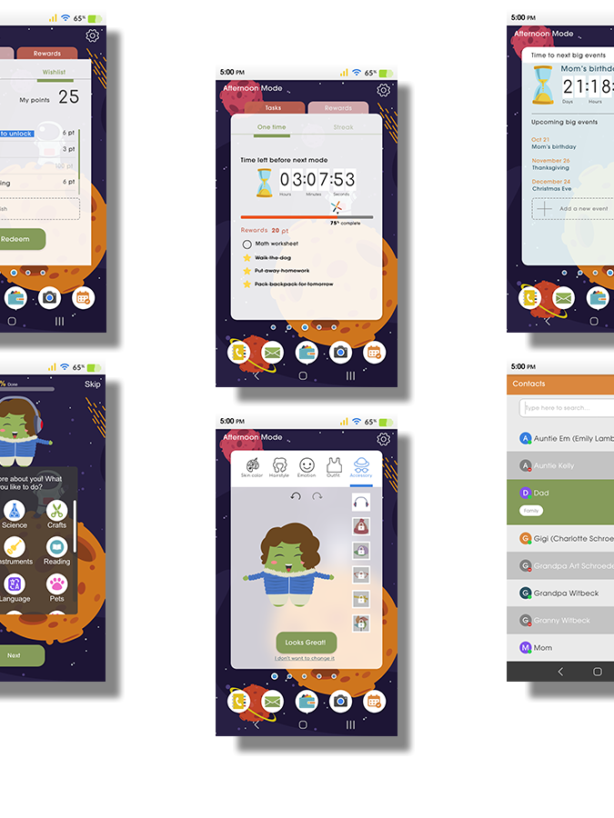
Hi-Fi Designs
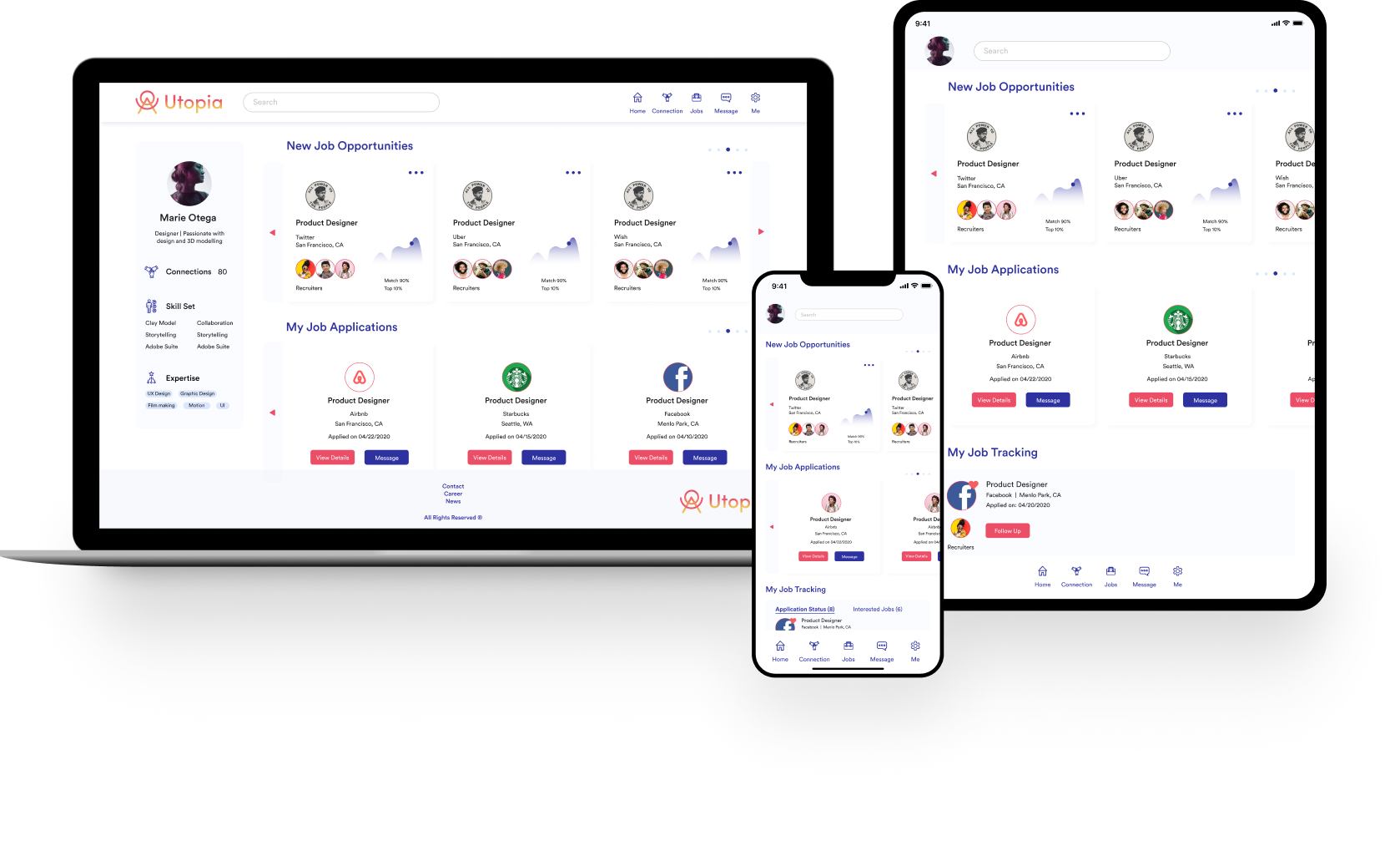
The whole website is designed under the standard of MVP (Minimum Viable Product) and light-weighted product.
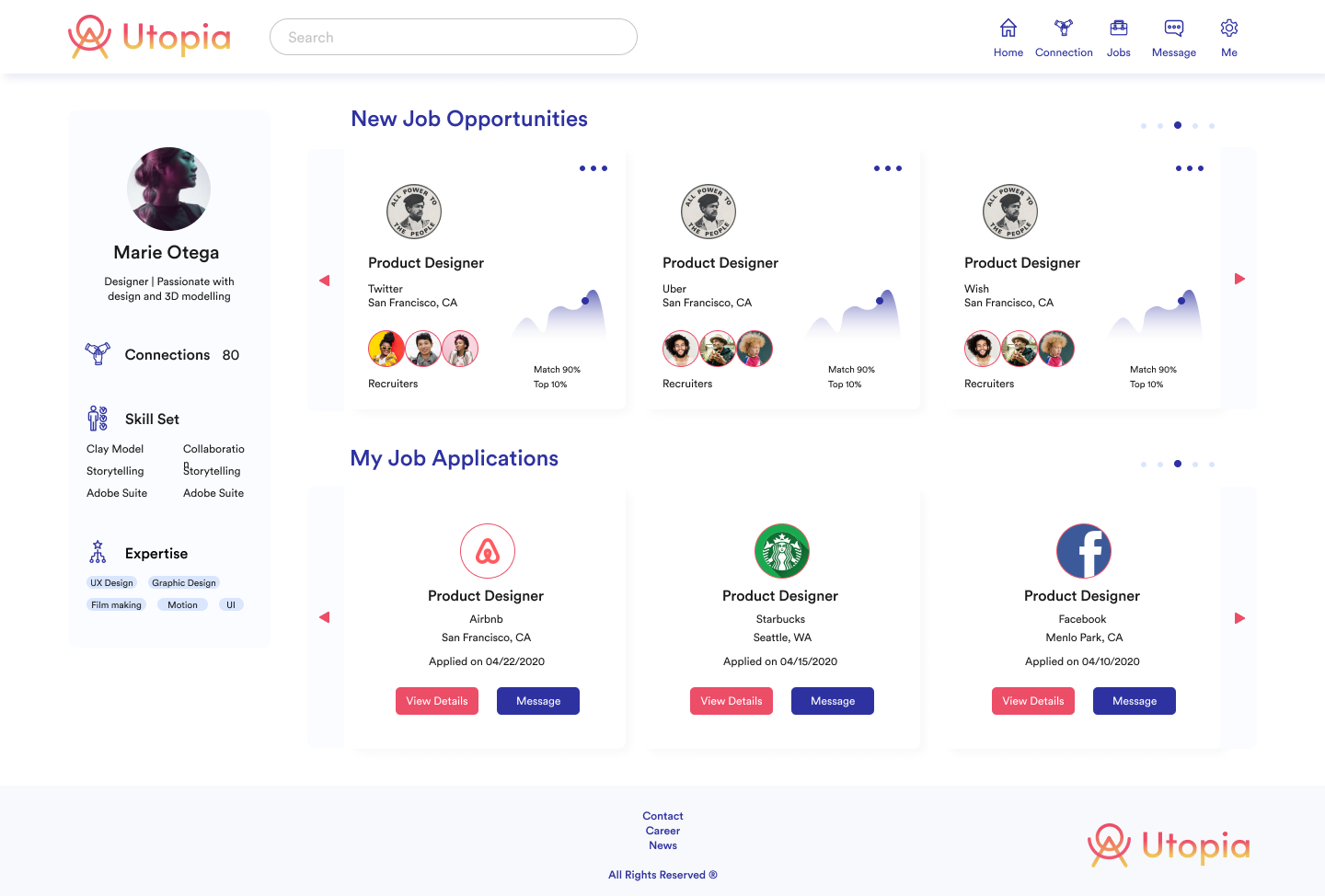
Home - Student
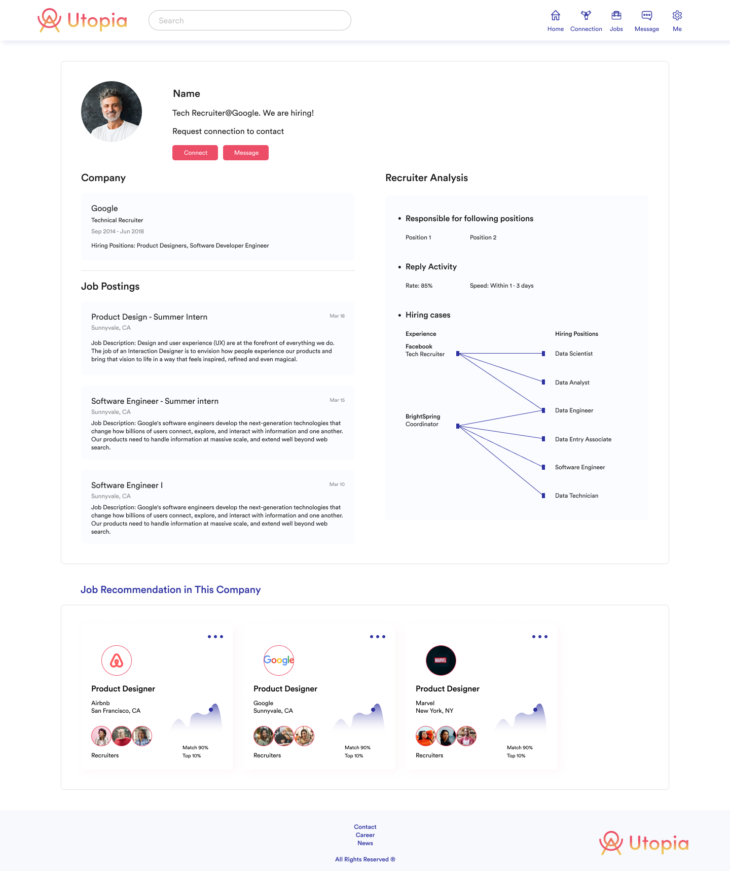
Recruiter Profile - Student View
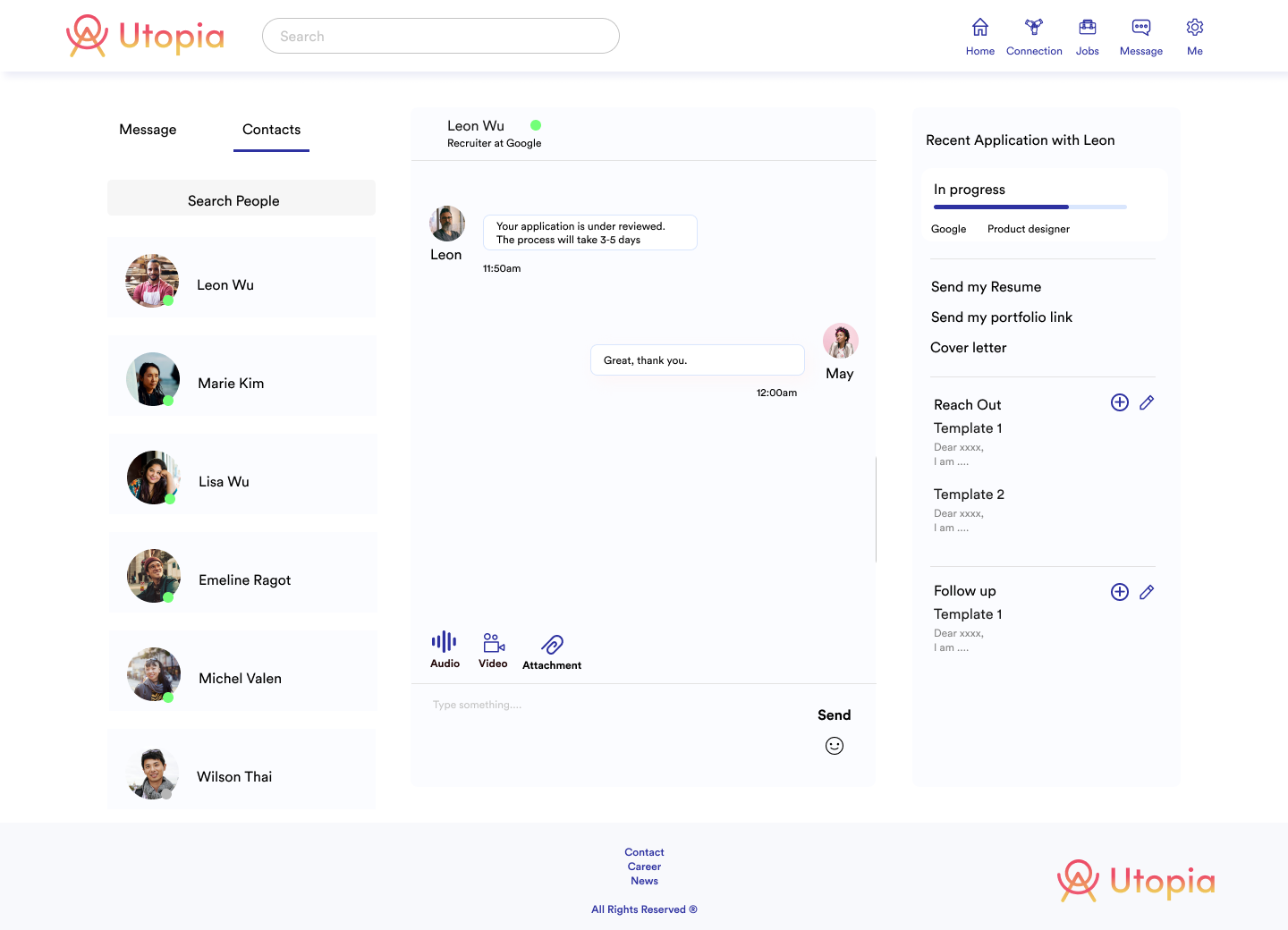
Message

My Applications - Student
Iterations Make Better Experiences
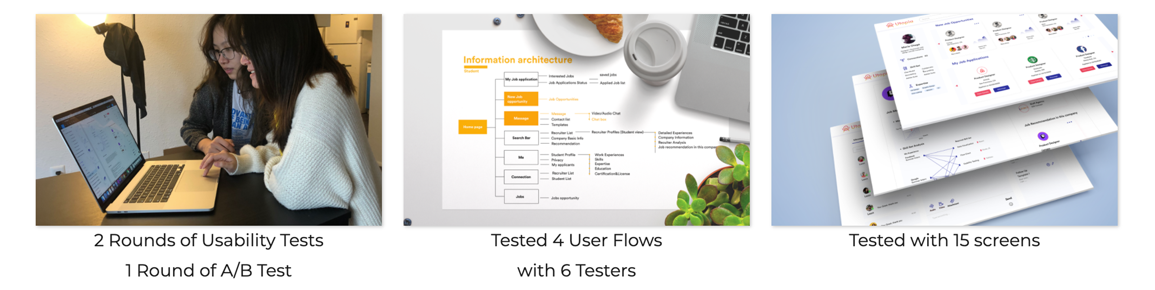
My team has done 3 rounds of iterations to improve every detail of the website from layouts to key features.
Example: Iteration of Analysis Chart
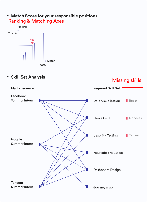
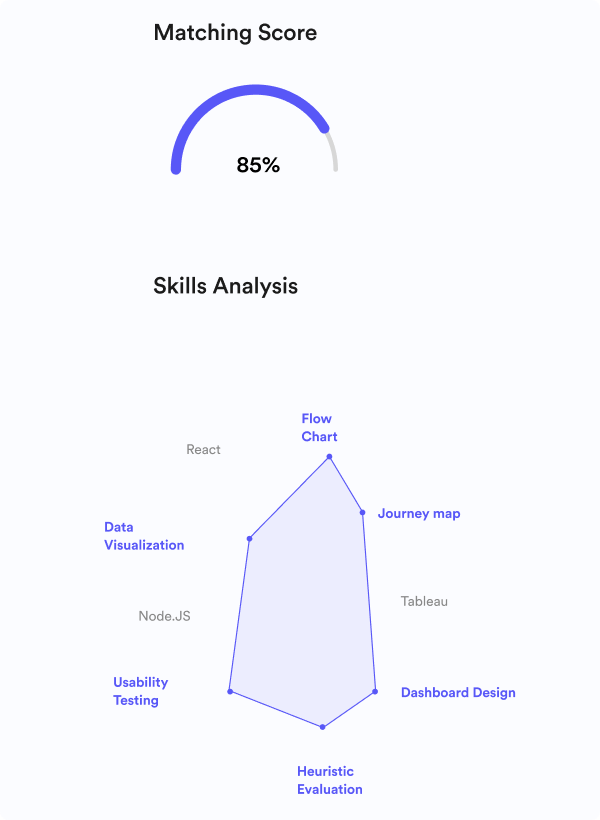
During usability tests, I noticed that users cannot understand our matching analysis very well such as can't find the missing skills of a candidate, and can't understand the meaning of the curve. So in the iterations, the designs are becoming more precise, and using as much visual language as we can to express the same message to the users.

V1: Impressionism curves and lines leading to misunderstandings
V2: Showing ranking and matching ratio and added missing skills
V3: More visually driven charts showing the ability analysis of a candidate as a whole
Prototype
Conclusion and Future Steps
• Research and tests are very essential in making design decisions. One small change makes a big different. More iterations have to be done to really help job seekers as well as recruiters to truly connect with each other.
• Design guidelines is crucial in promoting an efficient design collaboration and to keep everything standardized.
• The job application tracking system still needs a re-design to better works as a self-tracker.
• Design guidelines is crucial in promoting an efficient design collaboration and to keep everything standardized.
• The job application tracking system still needs a re-design to better works as a self-tracker.