Project Overview
Project Duration: 2 weeks
Team: Individual
Role: Graphic Designer
Tools: Paper and pencil, Adobe Illustrator, Adobe Indesign, Adobe photoshop
Skills: Graphic Design, logo design, drafting, mock-up design, market analysis, color theory, typography
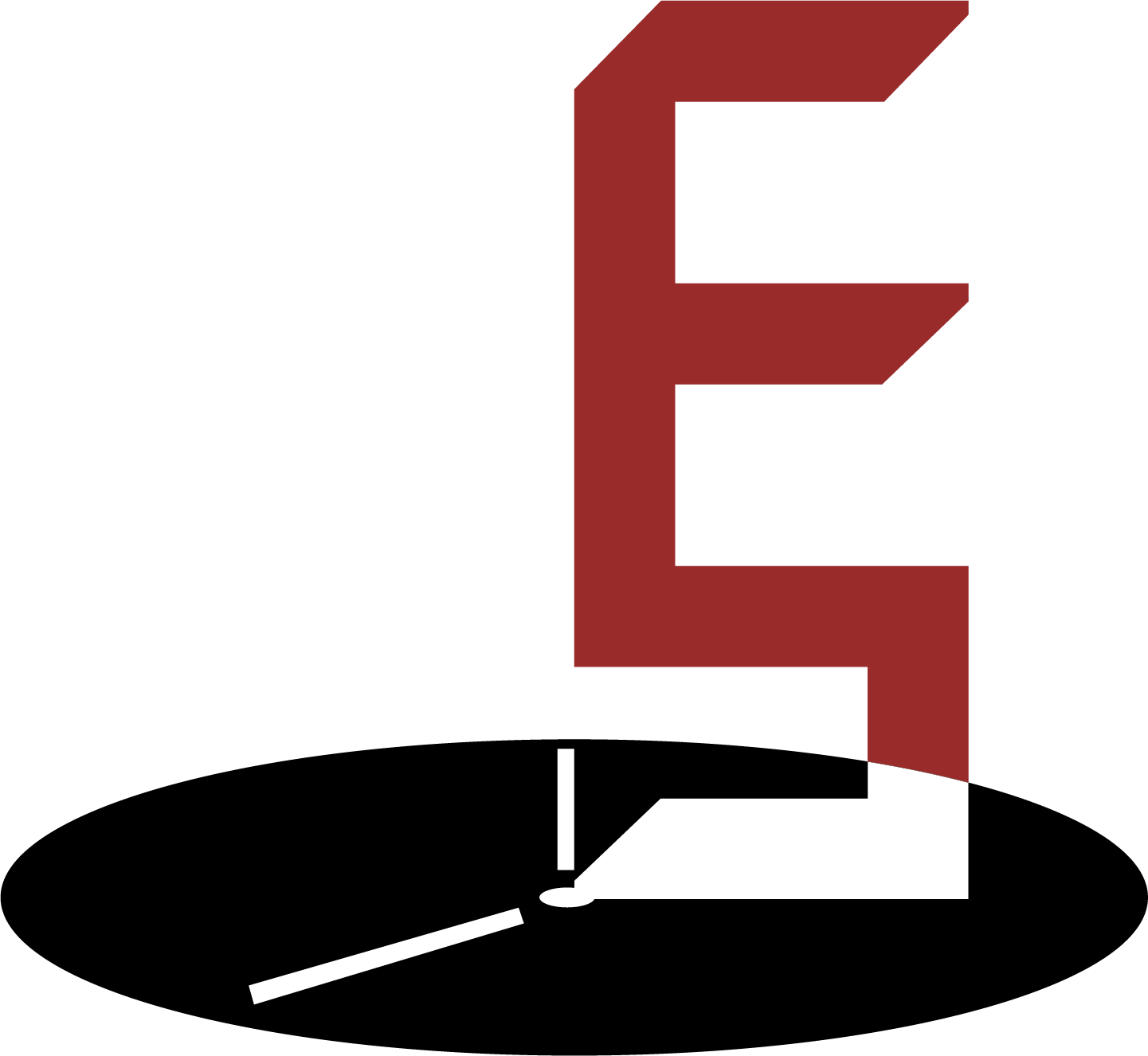
Logo option 1
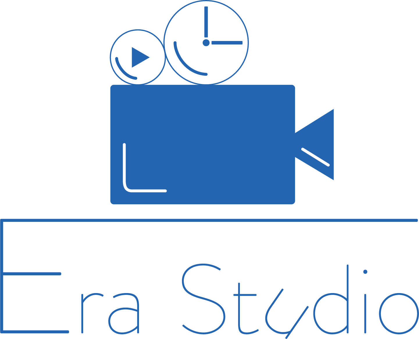
Logo option 2

Logo option 3
Context
Goal - Design a logo for a startup video production studio named Era Studio.
Company background - Era Studio is a small video production studio located in Los Angeles. The main business of Era Studio is making movies and videos for various media platforms. The video style covers from classic film making to modern short video clips for social media platforms. The studio provide service from idea brainstorming, to video production, and to marketing promotion.
Target audience - Ear Studio’s target audiences are mainly small/young film makers
in Hollywood and companies who want to make online videos to promote their products/services. While the main clients are business operators, it also makes videos for individual purposes such as wed- ding or graduation ceremony.
in Hollywood and companies who want to make online videos to promote their products/services. While the main clients are business operators, it also makes videos for individual purposes such as wed- ding or graduation ceremony.
Challenge
A logo that expresses the mission of the company
A logo that attracts the target audience of the company
A logo that fits the style of the company
Solution
Brainstorming the images that combines "era" and "studio" well.
Selected 3 logo options from many drafts and attempts.
Showing customer mock-ups to convince them.
Logo option 1
I combined the letterform of the initial letter "E" and "S" together, and put them on a clock indicating the "era". I also used bold color and straightly cut shapes to express the feeling of industrial and modern production.
Logo 1 - black and white
Logo 1 - black and white
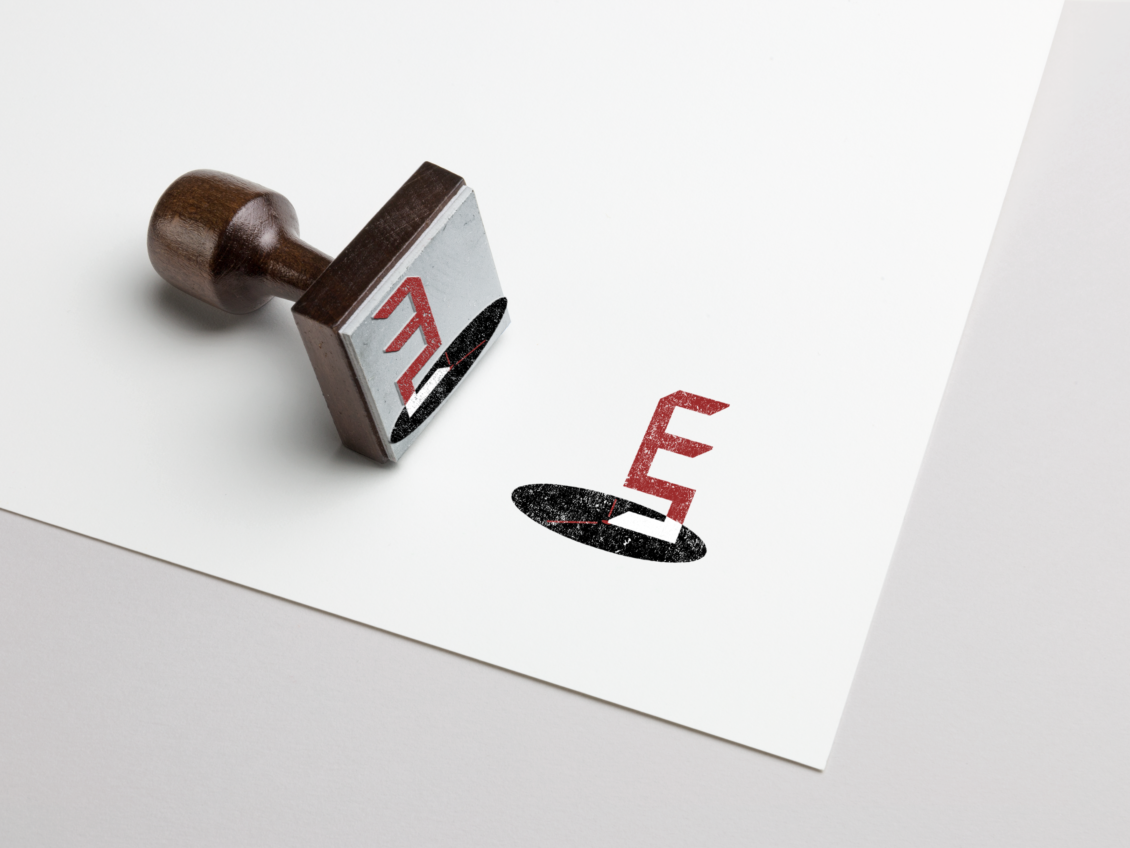
Logo 1 Mock-up - small

Logo 1 Mock-up - medium
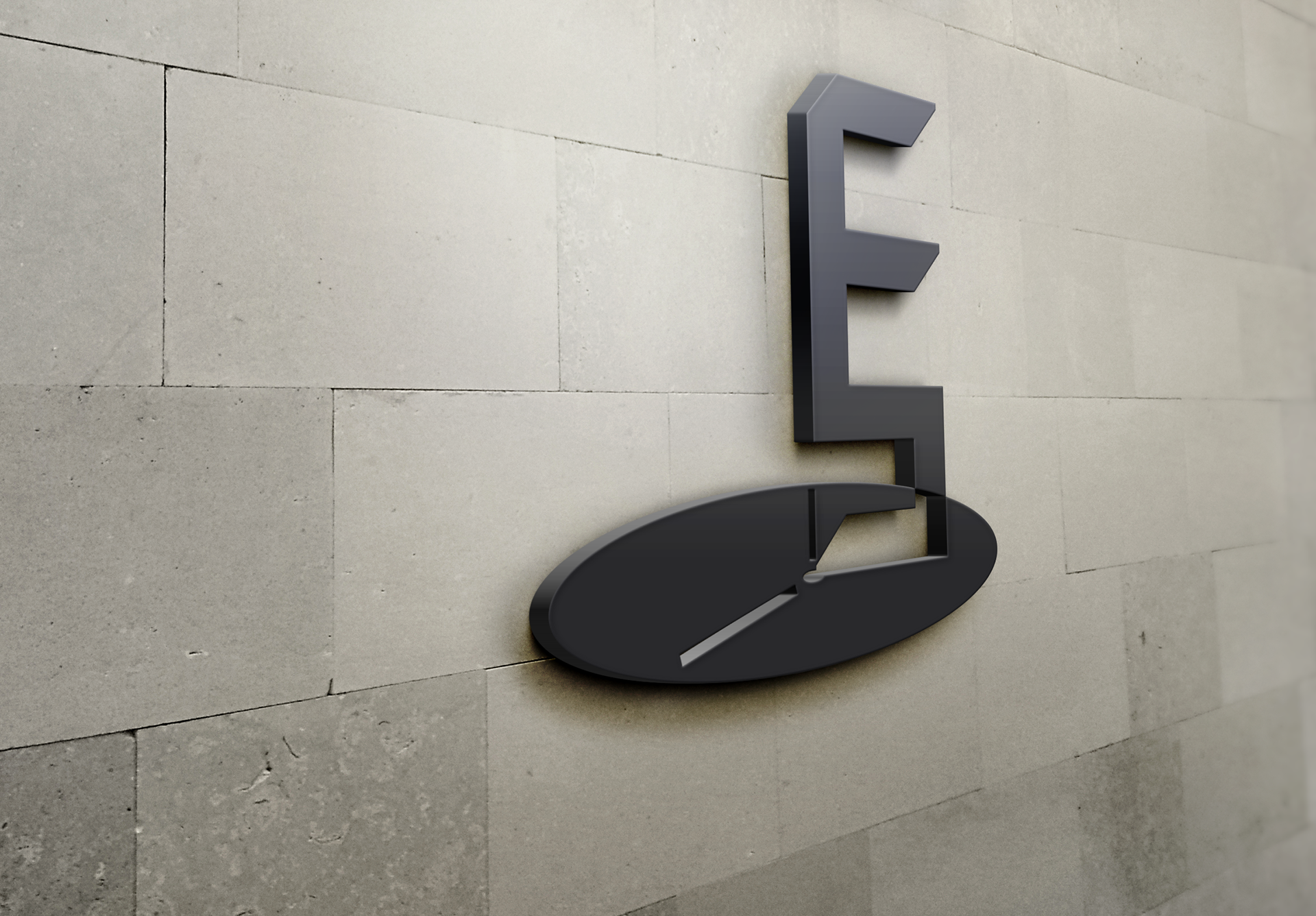
Logo 1 Mock-up - big
Logo Option 2
I used key elements - clock, camera, play button in the image part, and played with the san-serif fonts a little bit to make the design more vivid and eye-catching. This logo is more fashion and young with the light-weight fonts and icons in order to attract younger user group.
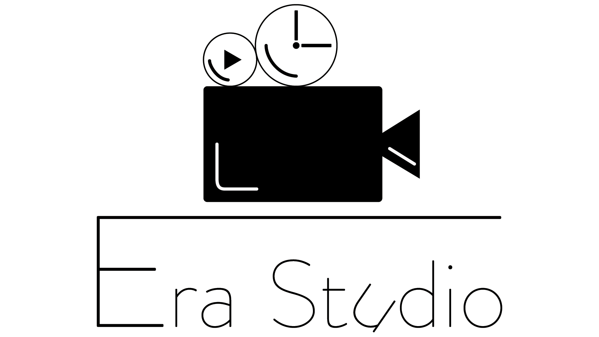
Logo 2 - black and white

Logo 2 - black and white
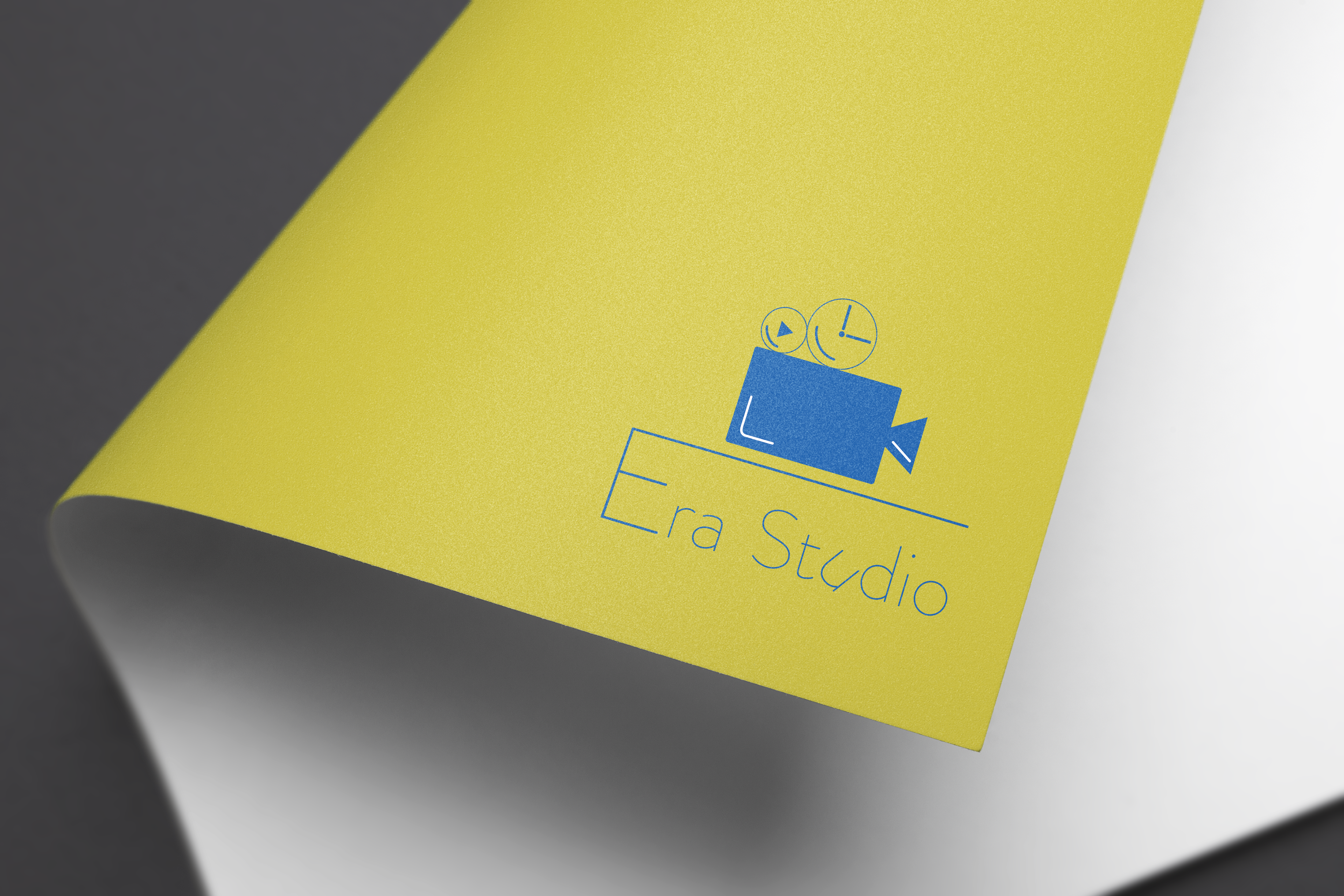
Logo 2 Mock-up - small

Logo 2 Mock-up - medium

Logo 2 Mock-up - big
Logo Option 3
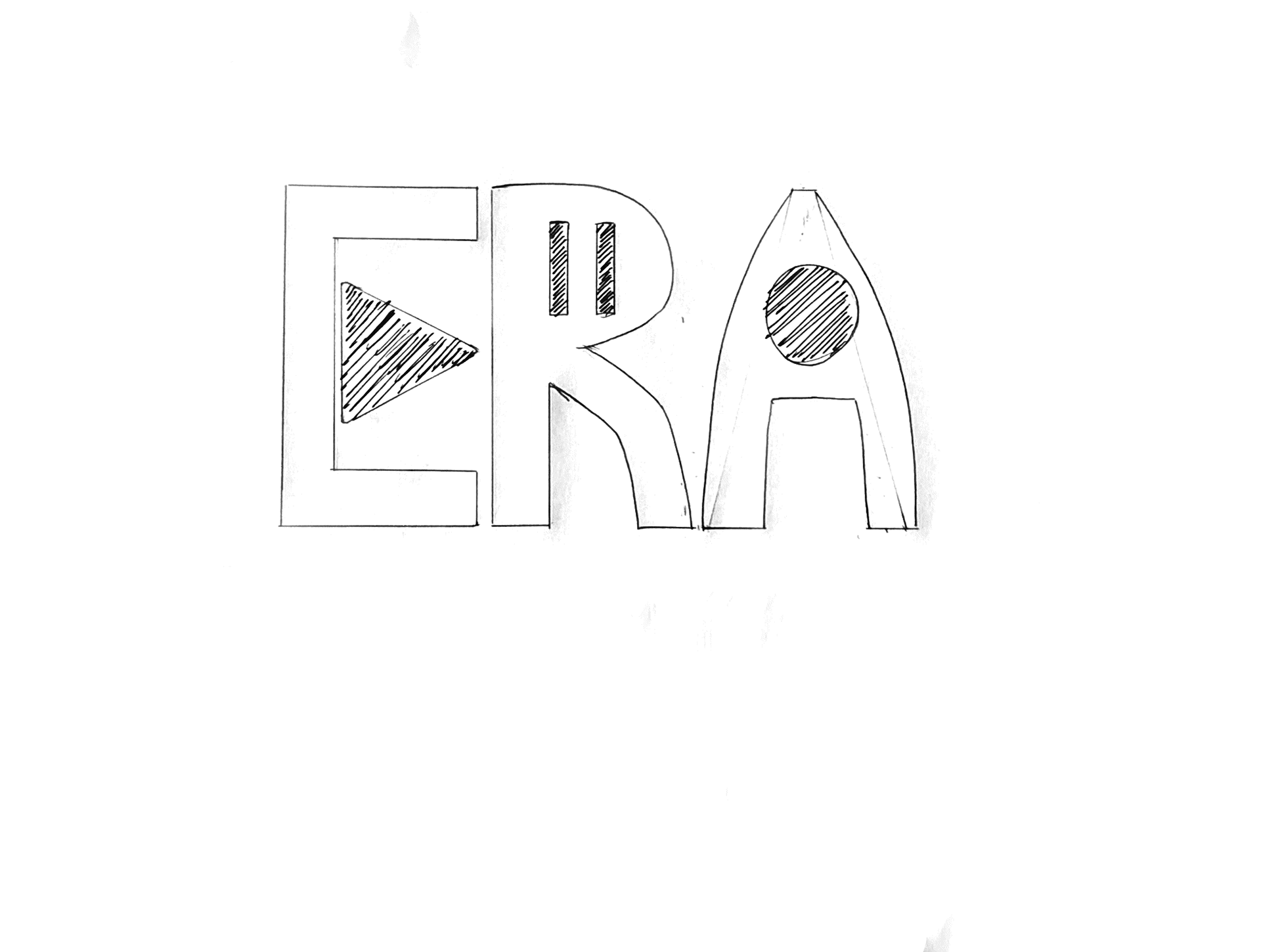
This option offers a stronger visual impact by using bold fonts and colors, and 3D designs. The word "ERA" looks like the shade of the camera, and the play, stop, and record button are hiding within the word. The whole design is expressing that the company is trustworthy.
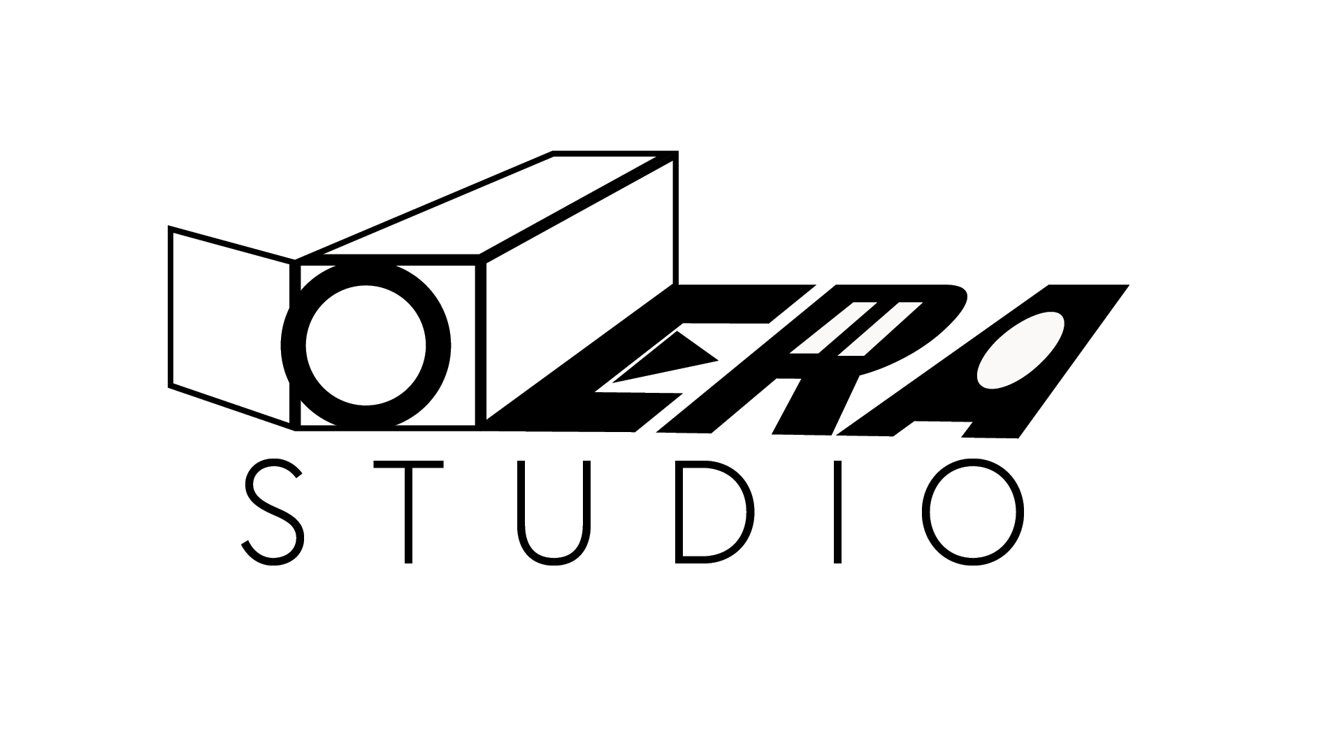
Logo 3 - black and white

Logo 3 - black and white
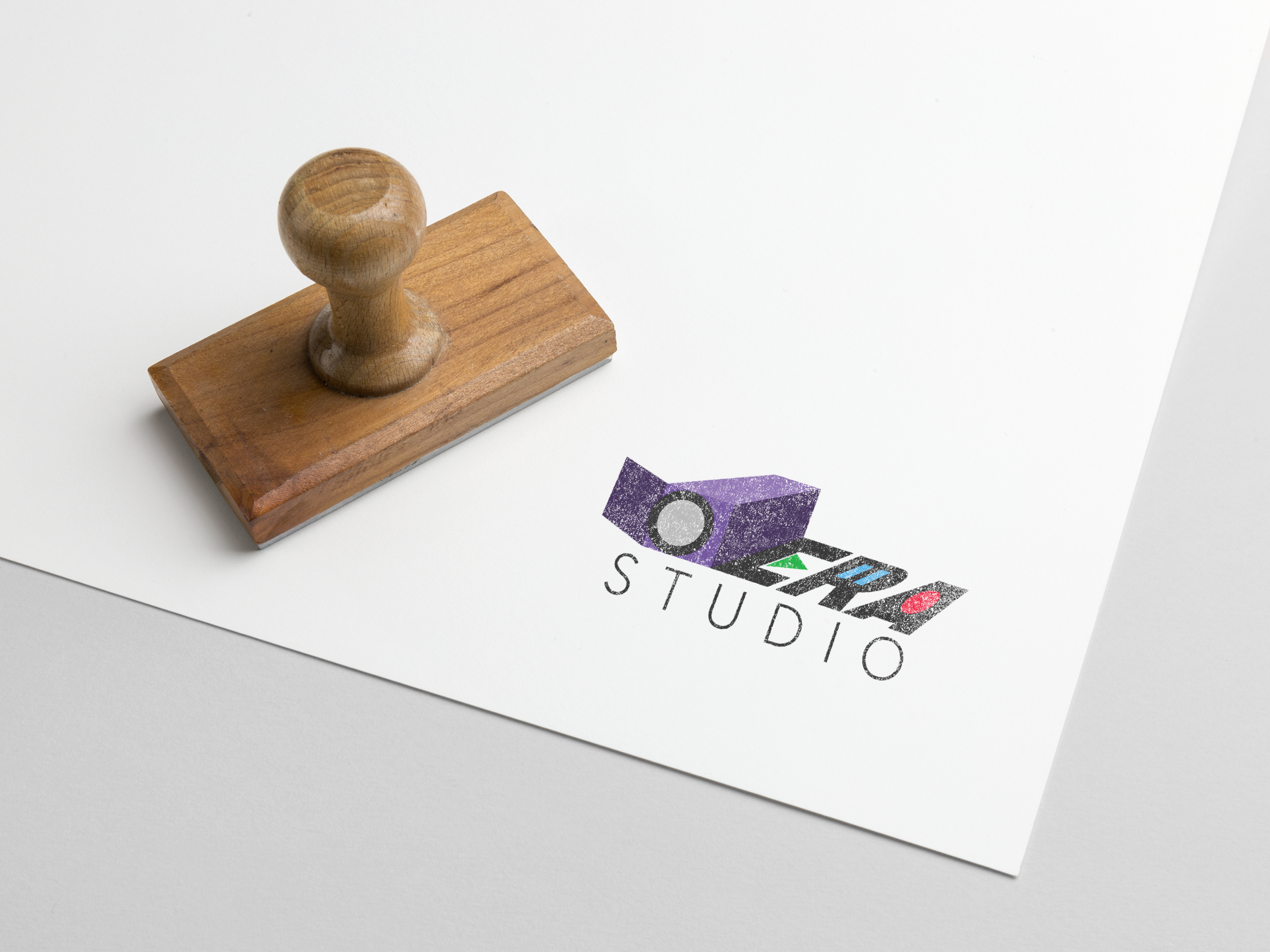
Logo 3 Mock-up - small
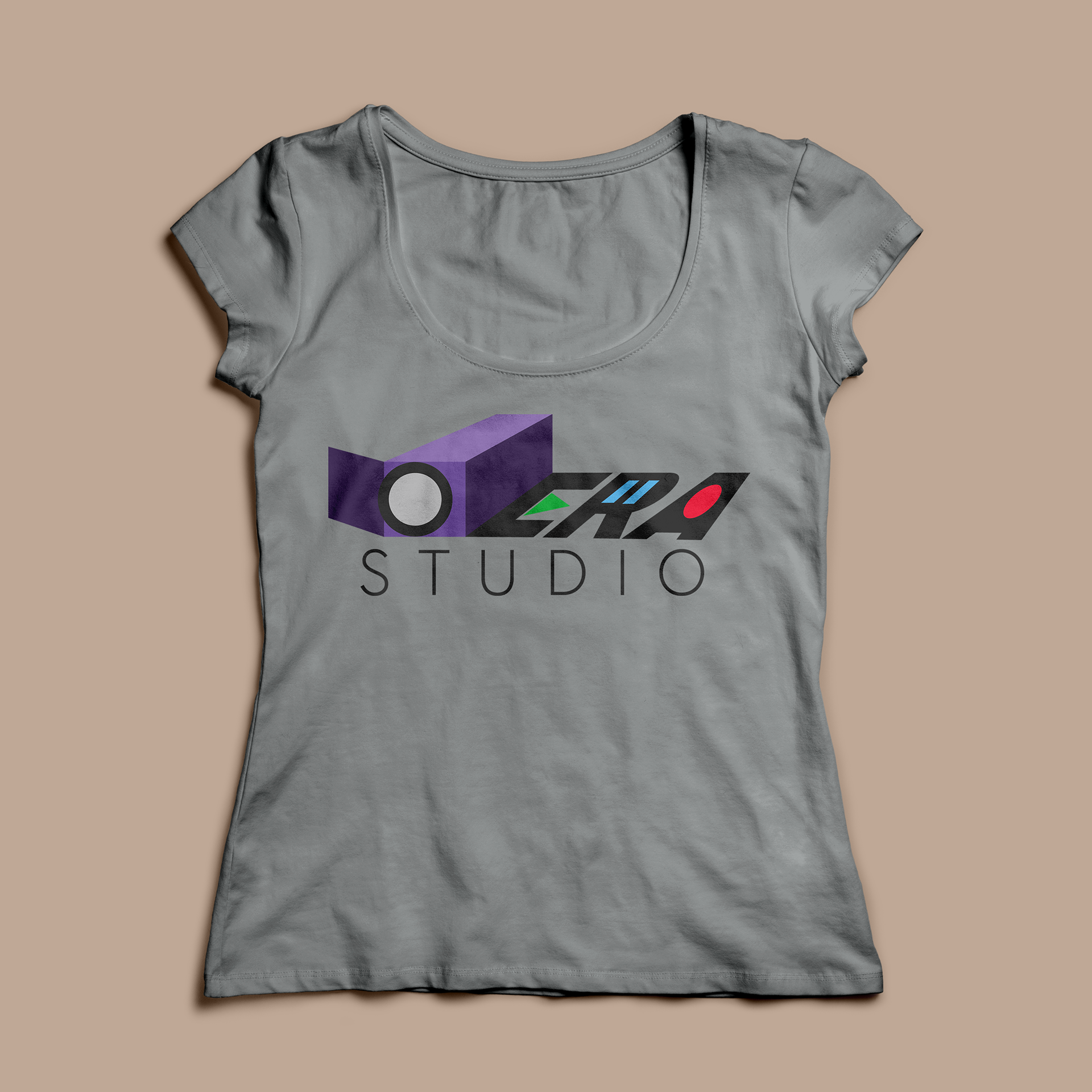
Logo 3 Mock-up - medium
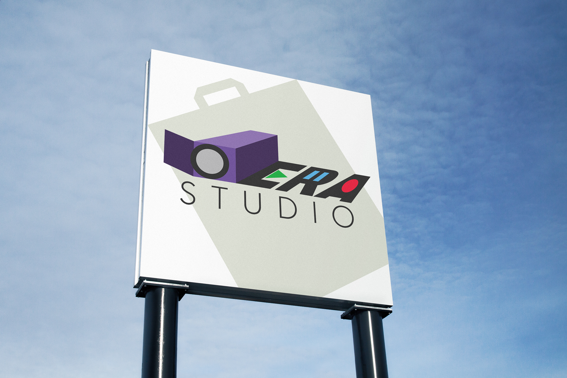
Logo 3 Mock-up - big
Design Process
To build the design from ground up, I did a lot of brainstorming, research and drafts to make sure the final options are the best for the company.
Word Tree
I created a word tree which is extended from the two words "era" and "studio" to seek inspiration
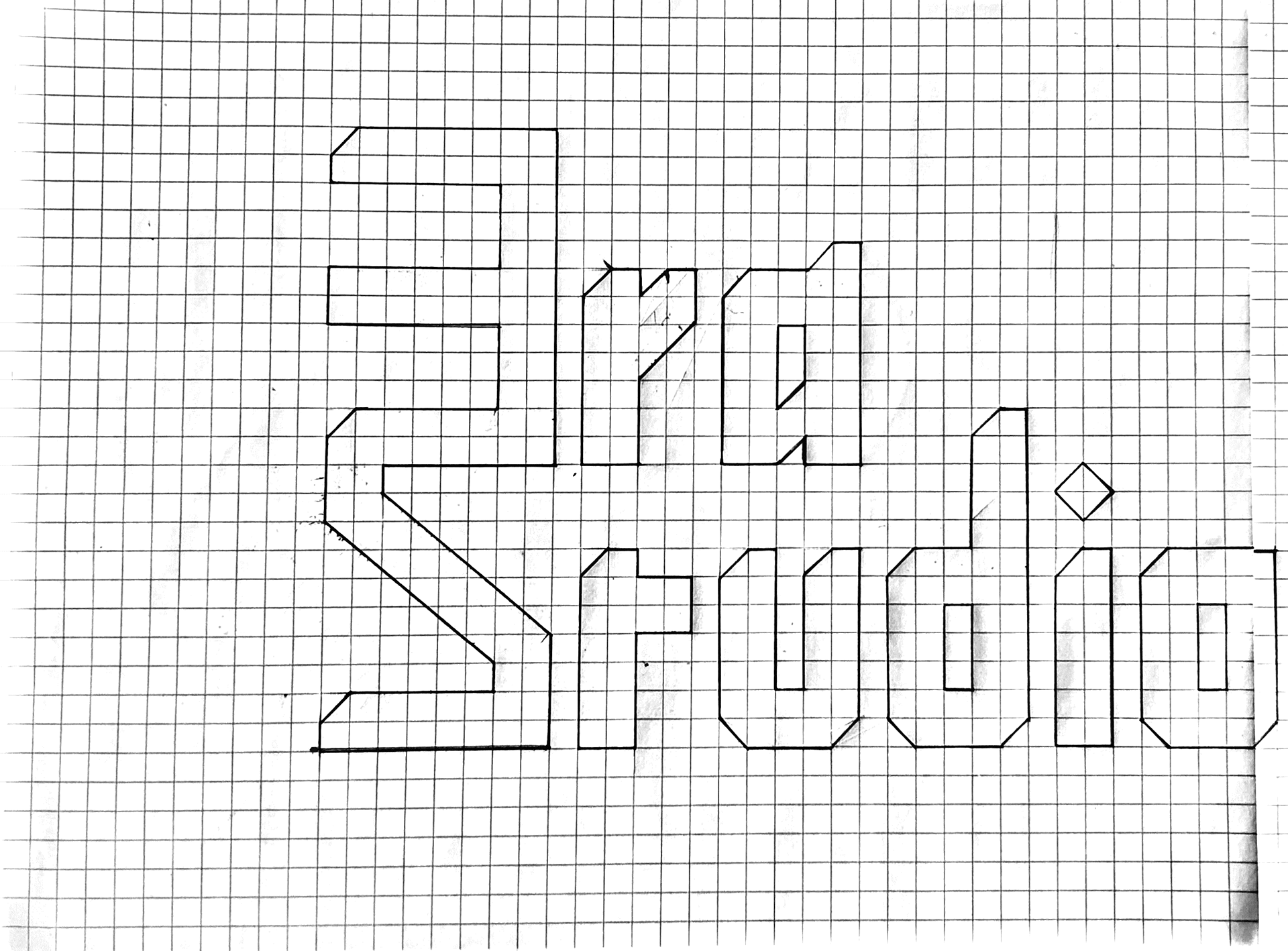
Drafts
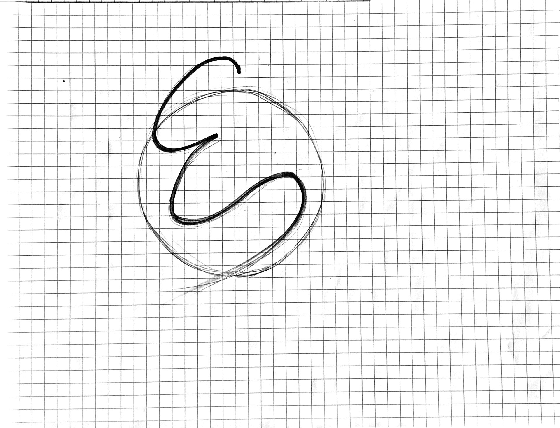
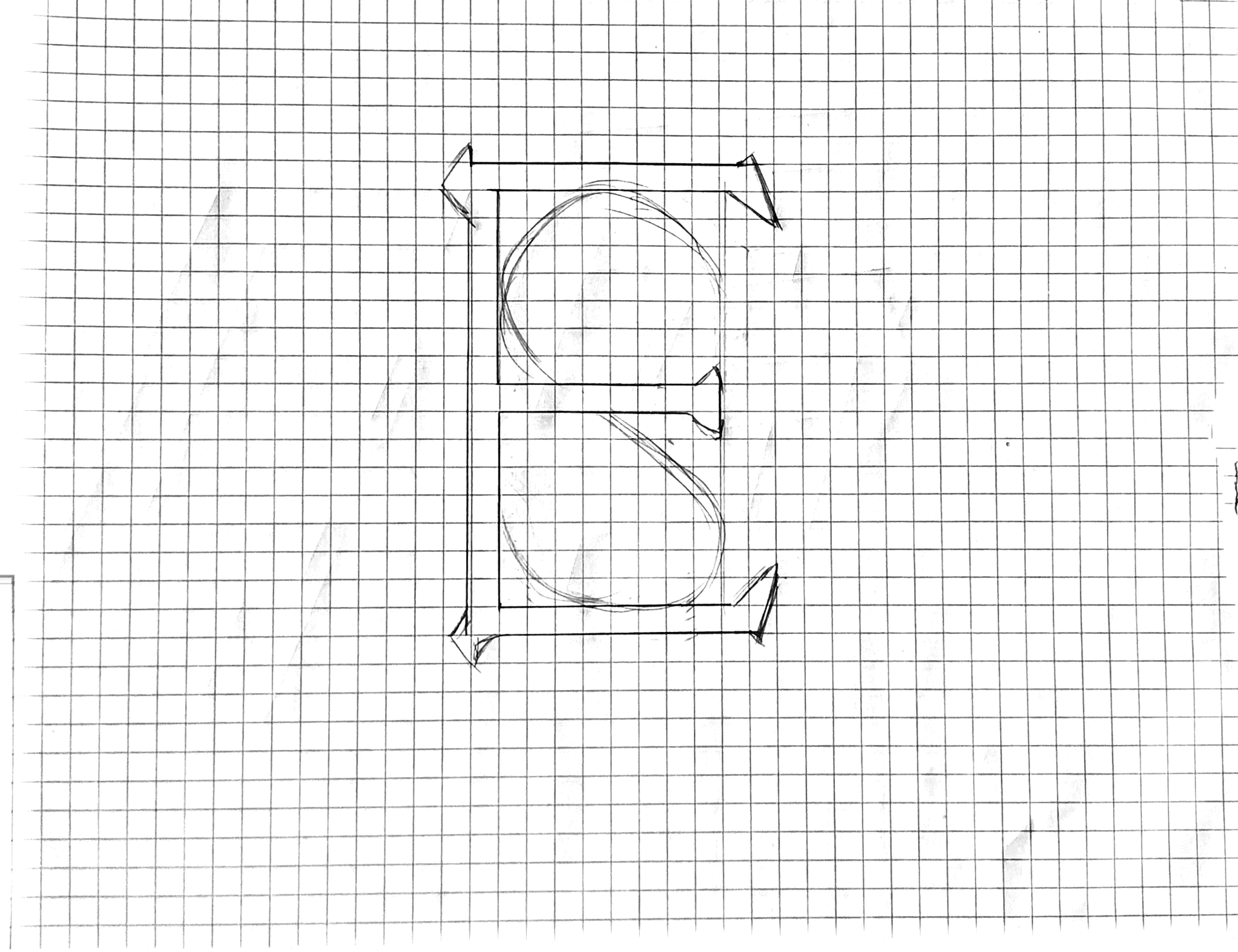
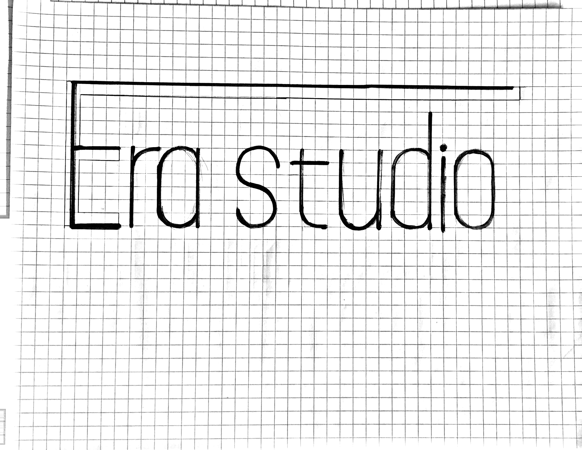
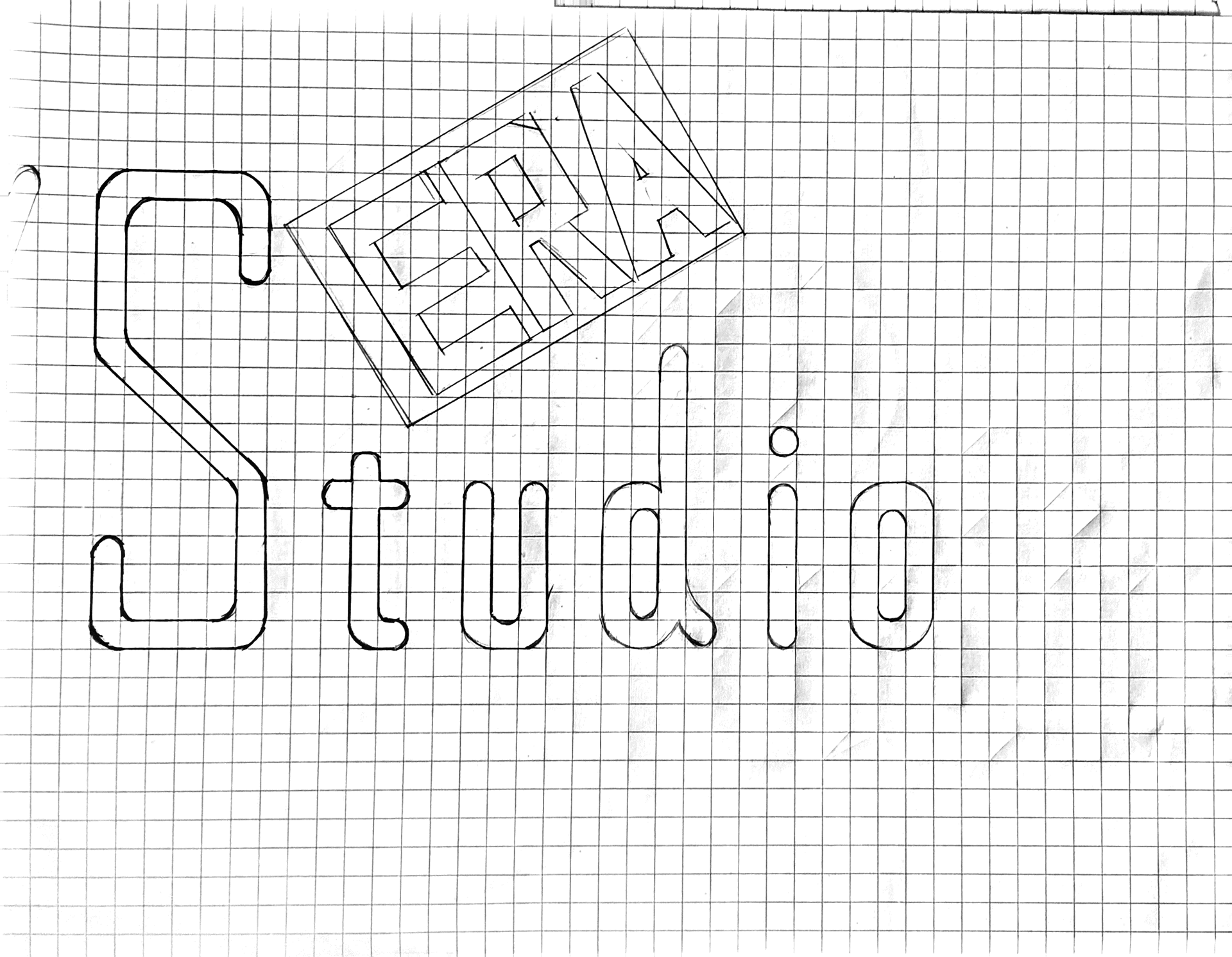
Drafts according to the word tree and impression of the company.


Logo Grid
Drafts of logo designs that is inspired by the select composition of keywords as a grid.
Keywords and Mood board
Selected keywords and mood board from the understanding of the company and its target audience.
Outcome
• To design a logo for a client, do not pick up a pencil immediately. Learn about the company, and learn about the audience is more important to start with.
• Try as many attempts and draft as possible. I worked as one individual designer, but my mind is not limited.
• Using mock-ups and storytelling to convince the client when pitching to them.
