CC Design
This is a logo for my design brand - CC Design. It consists of 2 letter C, embedded letter U and X, and my brand name. And it stands well for my design principles - Simple, modern, creative.
CC Design Logo
4/4 Music School
This is a logo for 4/4 Music School. The two number 4 becomes a # symbol, which also means upgrade in music theory. Students are welcomed to upgrade themselves at 4/4 Music School!
4/4 Music School Logo
Lednet
Lednet is a leadership app that I designed for self-claimed leaders to communicate and connect with each other. I used a curve to stand for letter "l" and "n" and they are connected together, which is the mission of the app.
Lednet Logo
Splitt
Splitt is a payment split tool. I named it Splitt to mean the user can actually "split" something, and the logo is a proportionally split rectangle, which could also be seen as a bill/check.
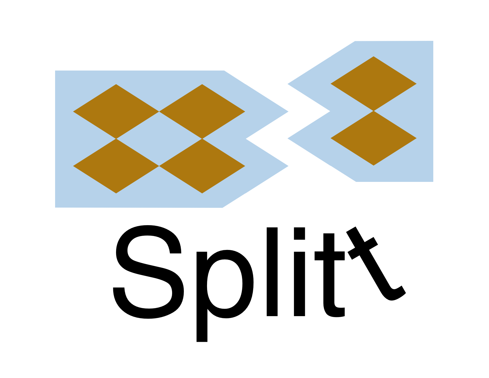
Splitt app logo
PvP
PvP is a dating app that I designed for gamers. I used this name because it means (player vs. player) in gaming language, which also means the meeting of two gamers. I designed the logo in a pixel style to recall the memory of old games, and I put a heart that stands for a relationship in the negative space of the letter "v".
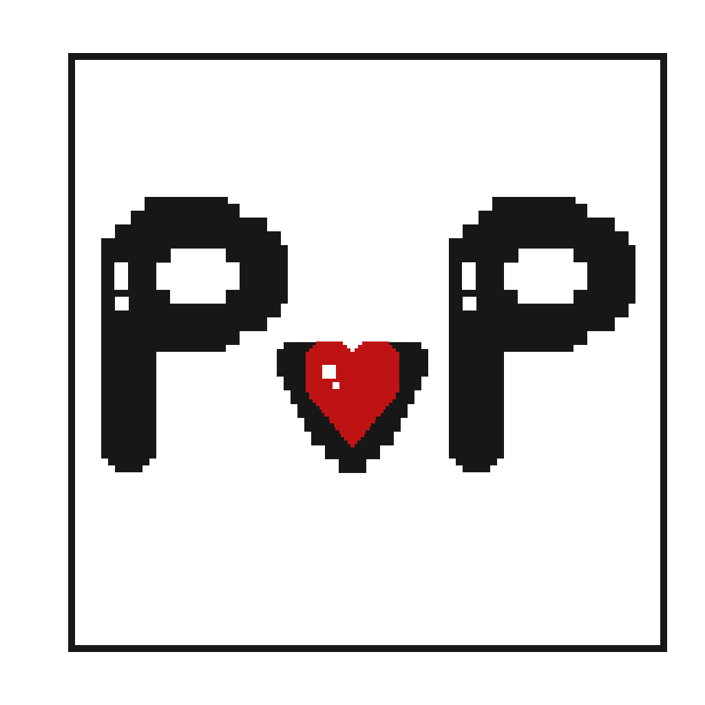
PvP app logo
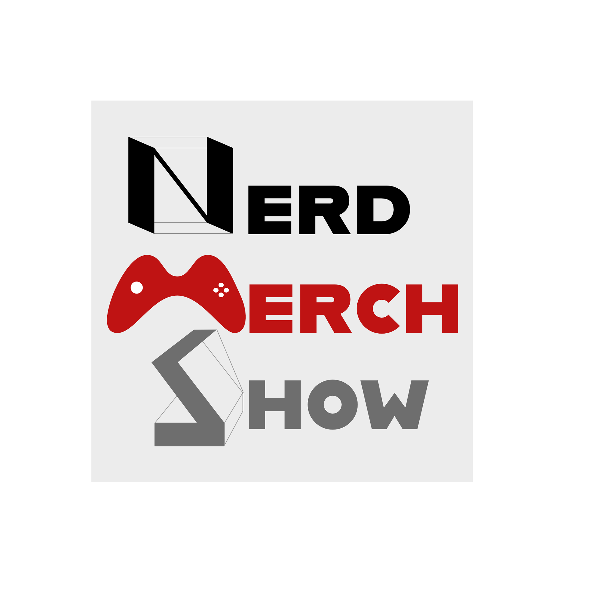
Nerd Merch Show
Nerd Merch Show is a TV show where the 2 hosts introduce the latest game related merchandise to the audience. I designed 3 logo options. The first logo plays in a circulation where one guy opens a box and another guy came out of it. The second logo focuses more on the name of the show by highlighting the initials, and showed a cute Gozilla with a merchandise package. In the third logo, I played with the shape of the three initials, and changed the letter "N" and "S" into packages, while letter "M" into a gaming controller.

Logo option 1
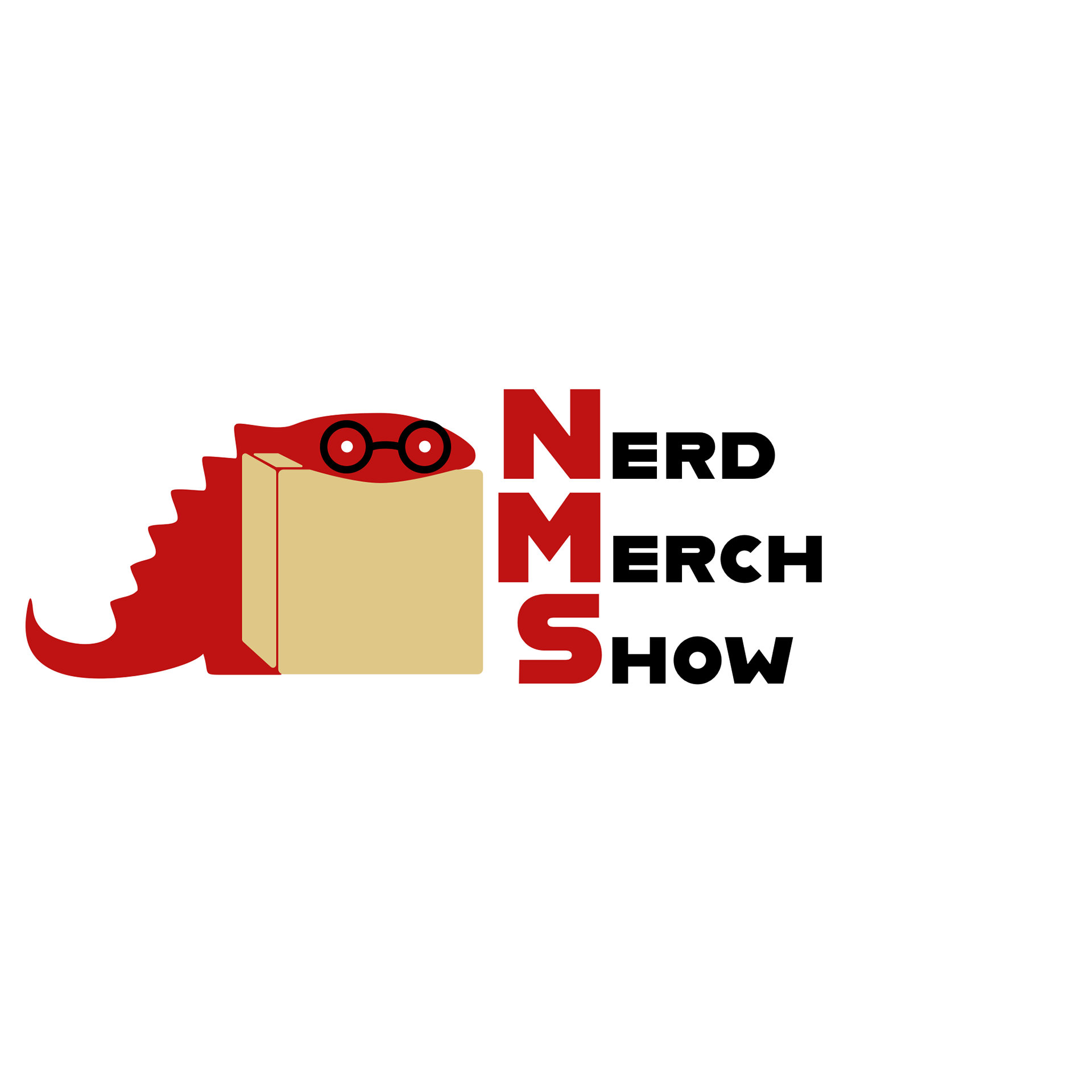
Logo option 2