Context
Frush locker is an individual class work of the Intro to User-centered Design class at the University of Washington (Autumn 2020). The design process starts from market and user research to paper and digital design, and finished with usability tests and iterations.
Overview
Project Name: Frush App Design
App Platform: iOS 14 (iPhone 11 Pro)
Duration: 3 months (A quarter class)
Team: Individual
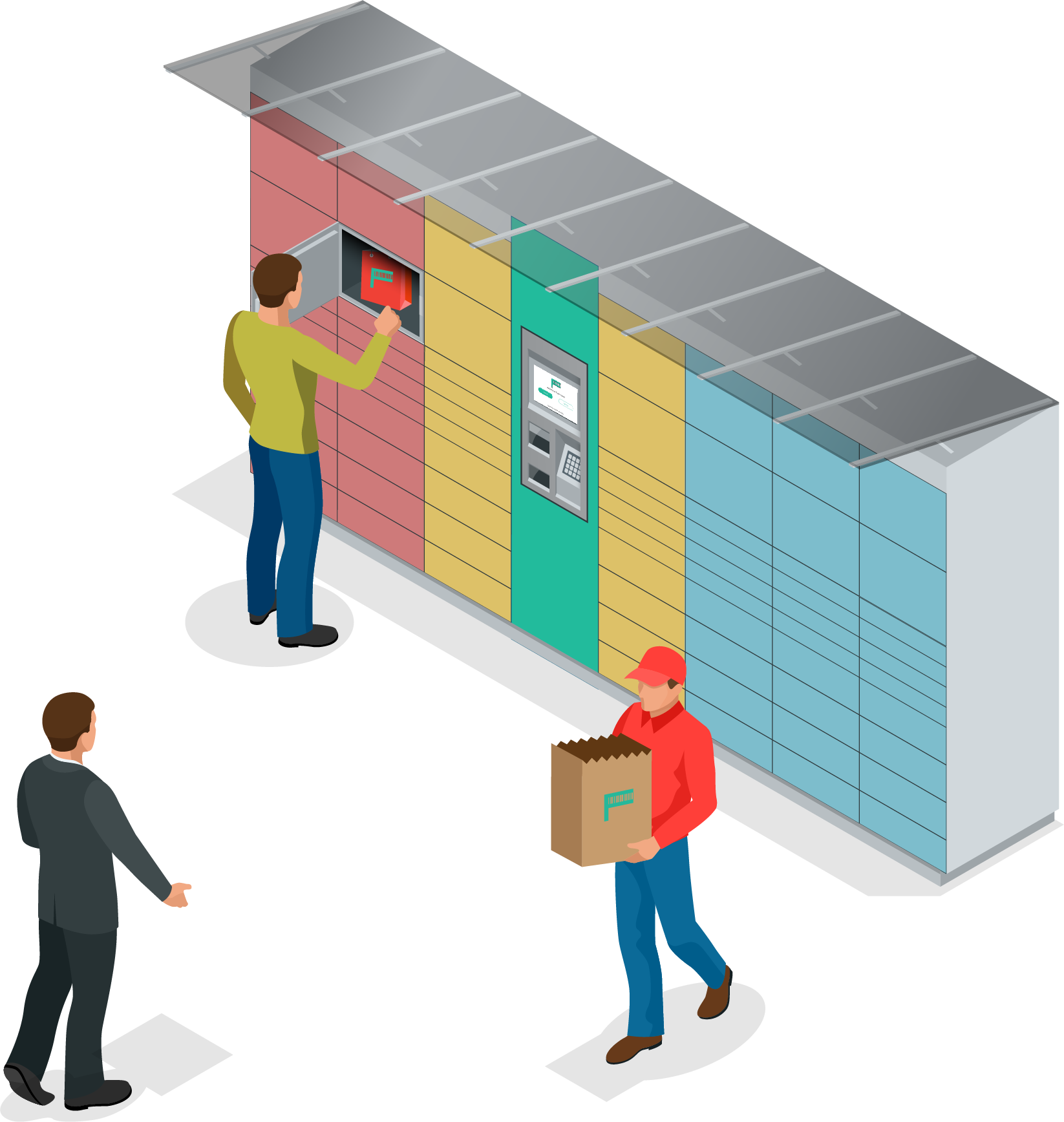
Frush Locker Mock-up
Instructor
David Holmberg | Senior UX Designer@Amazon
Skills & Tools
Skills: User Research, Market Research, User Journey Map, Storyboards, Fast Sketching, Paper Wireframing, Digital Wireframing, Hi-fidelity design, Prototyping, Usability Tests
Tools: Adobe Creative Suite, Figma, Zoom, etc.

Problem Statement
Food delivery became a hot topic during the COVID-19 pandemic. Although a lot of companies are working on food delivery or pickup apps, there is still not a perfect way for the busy users, especially those who live in apartments, to have flexibility to choose when to pickup their food deliveries safely (without the delivery been stolen, left in the lobby, or extra contact with the delivery person) with good food quality (in good shape and temperature).

Research
In the research phase, I did market research, user interview, user survey, and user journey map, and user persona in order to define the user pain points, and see what I can improve using my design and my product. Steps and methods taken for the research:
• Competitor teardown
• User survey
• User interview
• Storyboard
• User journey map
• Persona and scenario
Competitor Teardown
Since there are too many food delivery apps on the market, I chose 4 of them - UberEats, Chowbus, Fantuan, Grubhub as examples, and analyzed their checkout process - which could be the most close comparable process to Frush locker.
Checkout - UberEats
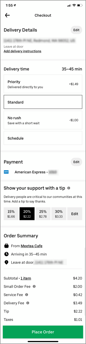
Checkout - Chowbus
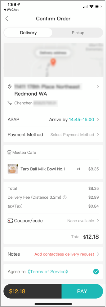
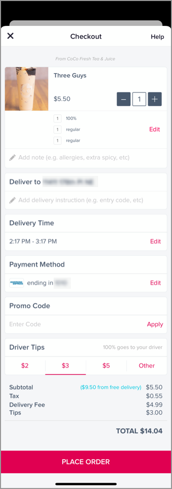
Checkout - Fantuan

Checkout - Grubhub
What are the common elements?
• The review of order details
• Clear CTA
• User location indicator
• Some levels of options
• The review of order details
• Clear CTA
• User location indicator
• Some levels of options
What are the major themes that I consider emulating?
• Map version vs. list version
• Multiple delivery options
• Address management
• Map version vs. list version
• Multiple delivery options
• Address management
User Interview
I interviewed with 5 users who regularly order food with apps. During the interview, I noticed that there are a lot of similarities in the food delivery experience even though these users do not know each other. And some key user pain points can be known from the interview as well. Some of the findings are very helpful for me to build a new food delivery experience for the users.
Similarities:
• Age range is 25-35 (5/5)
• Most of the user live in apartments or townhomes (4/5)
• Order food delivery 1-3 times a week (5/5)
• Most of the case, the users order food via an app (5/5)
• All the interviewees order more delivery than before the COVID-19 pandemic (5/5)
• As many as possible food choices is an important criterion when choosing an app (4/5)
Pain Points:
• The food delivered to the users does not taste as good as in the restaurant (2/5)
• Sometimes part of the order is missed (2/5)
• Long waiting time results in the users’ frustration (3/5)
• The communication between the user and the delivery person is not smooth and it leads to misunderstanding or even argument (5/5)
• For users who live in the apartment, the delivery experience is worse due to access control (2/2)
• Users are worried about the cleanness of the food package during the COVID-19 pandemic (5/5)
Storyboard
Based on the results of user interview, I created a storyboard that shows how can Frush app solve at least some of the user pain points found.

Frush Storyboard
User Journey Map
Combining all the findings during the research phase, I've created this user journey map to show how the user feels and thinks at each stage using the survey results to support the results, and how can Frush app help the user in a clear grid view.
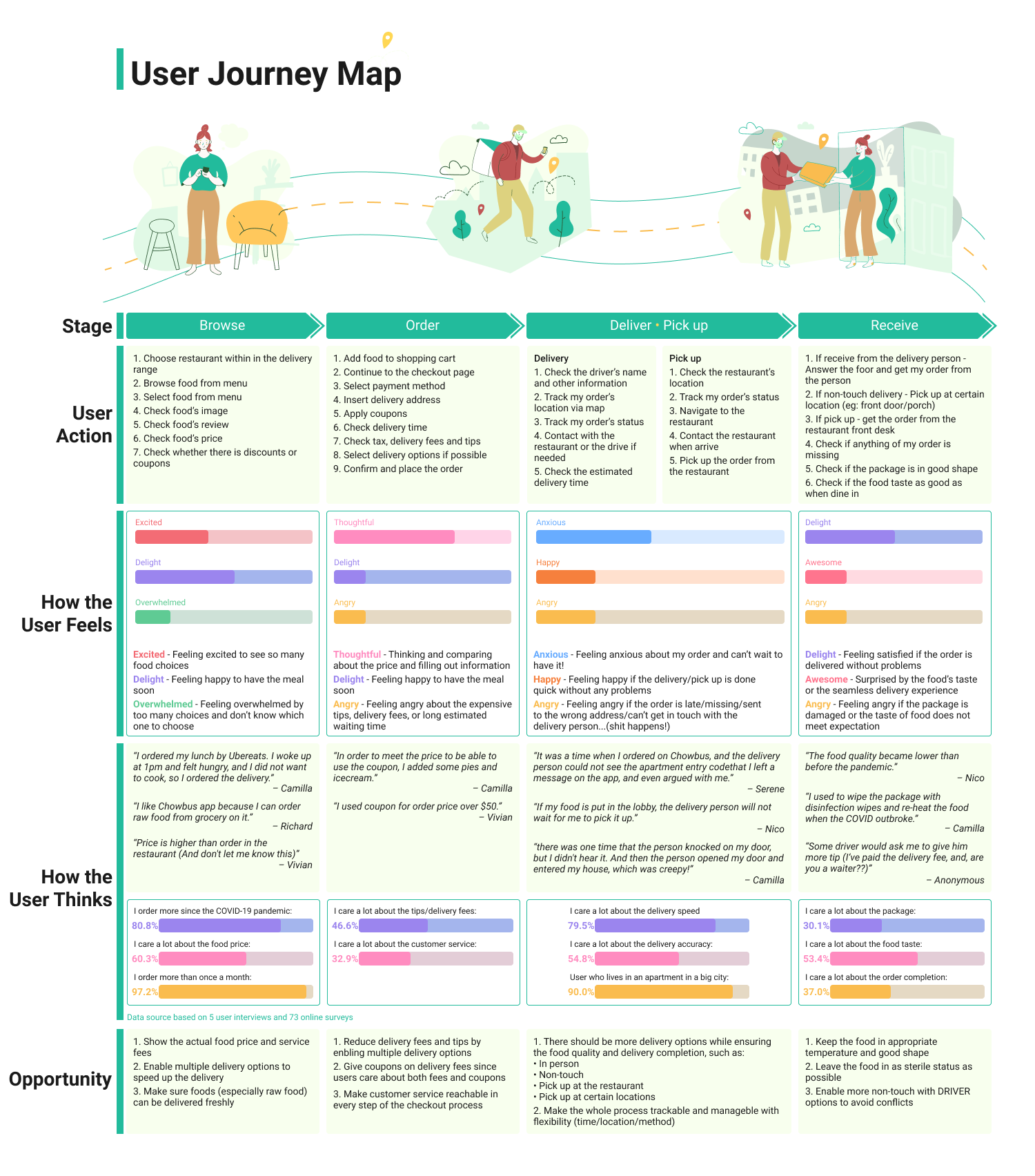
Frush User Journey Map
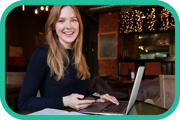
User Persona
Name: Vivian
Pronouns: She/Her/Hers
Location: Downtown Seattle, WA
Occupation: Business Intelligence Engineer
Vivian is a working professional at a local tech company. She used to work onsite, and there were many lunch choices around her office. But this year, Vivian began working from home since the COVID-19 pandemic started. Since all the restaurants are closed and she doesn’t have time to cook, lunch becomes a huge problem for her. Her apartment has an access control at the lobby, when she orders food delivery the delivery person cannot always get into the lobby without trouble. And sometimes when the delivery person calls Vivian for access help, if she is during a meeting, it’s impossible to answer the phone. And when the meeting ends, the food is either cold or in bad shape, sometimes even stolen. So her food is often left outside her apartment. She wishes that there could be a way for her to get her lunch delivery conveniently and safely.

Solution
Therefore, here is Frush app: For busy professionals and students who need an efficient and convenient way to get their food deliveries, Frush provides safe, clean, temperature-controlled non-touch food delivery experience. Unlike other food delivery apps, it reduces the direct contact with the driver while ensuring the food is at its best taste.

Design
To answer the problems found in the research phase, I've designed an ad-hoc app to any food delivery apps named "Frush". The user can choose pickup time and location according to their own scenarios, and even choose the locker's temperature to better ensure their order's taste. With that idea, the following steps are taken:
• Sketch
• Wireframing
• Logo design
• Hi-fidelity design
• Usability tests
• Evaluations and Iterations
User Flow
The complete user flow of Frush is consists of two parts - the first part is the flow on the app from choosing a locker to confirm an order. The second flow is on the actual locker screen when picking up orders. My design mainly focused on the first user flow.
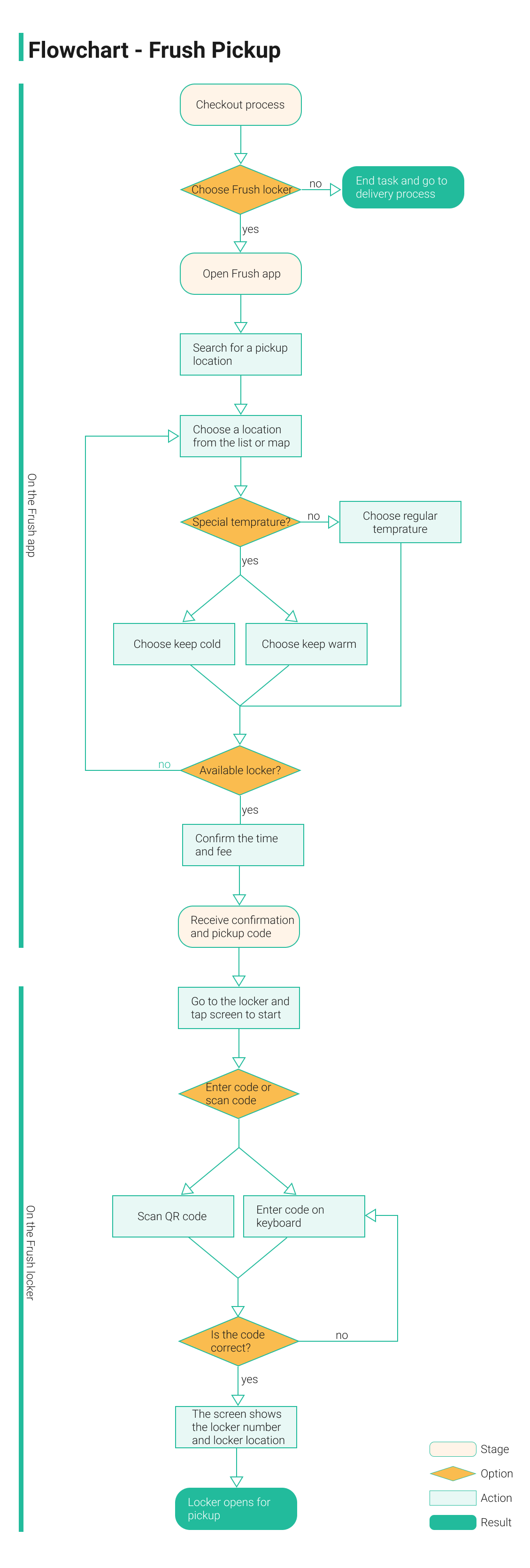
Frush User Flow
Sketching
Based on the user flow, I created some sketches, and each of them was a set of 3 versions of the same screen so that I could choose the most suitable one after design critiques.
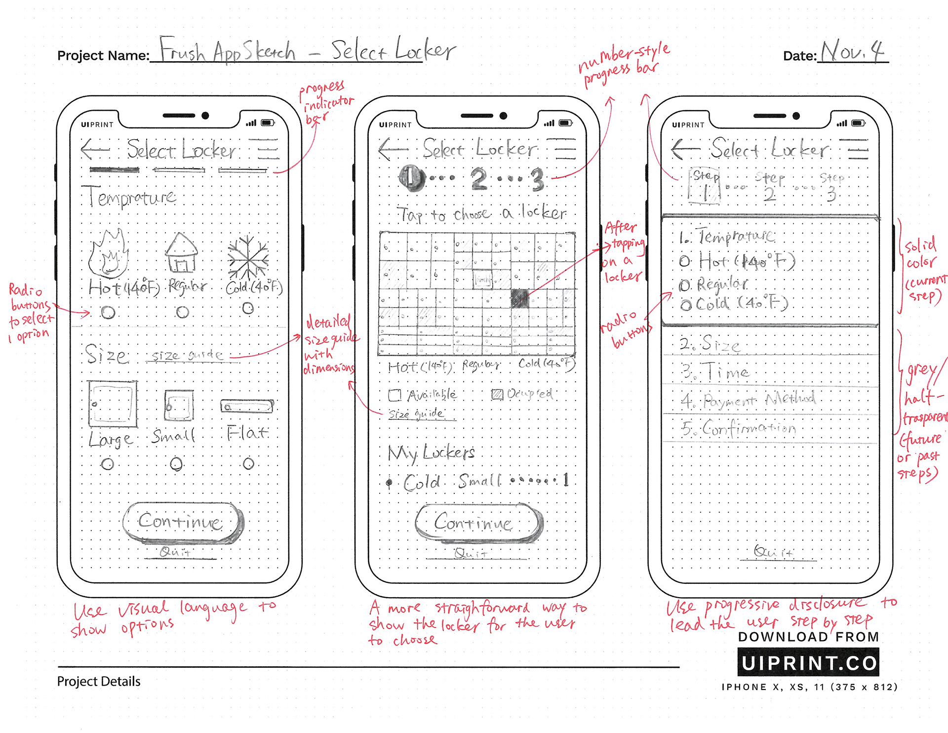
Sketch - Choosing a locker
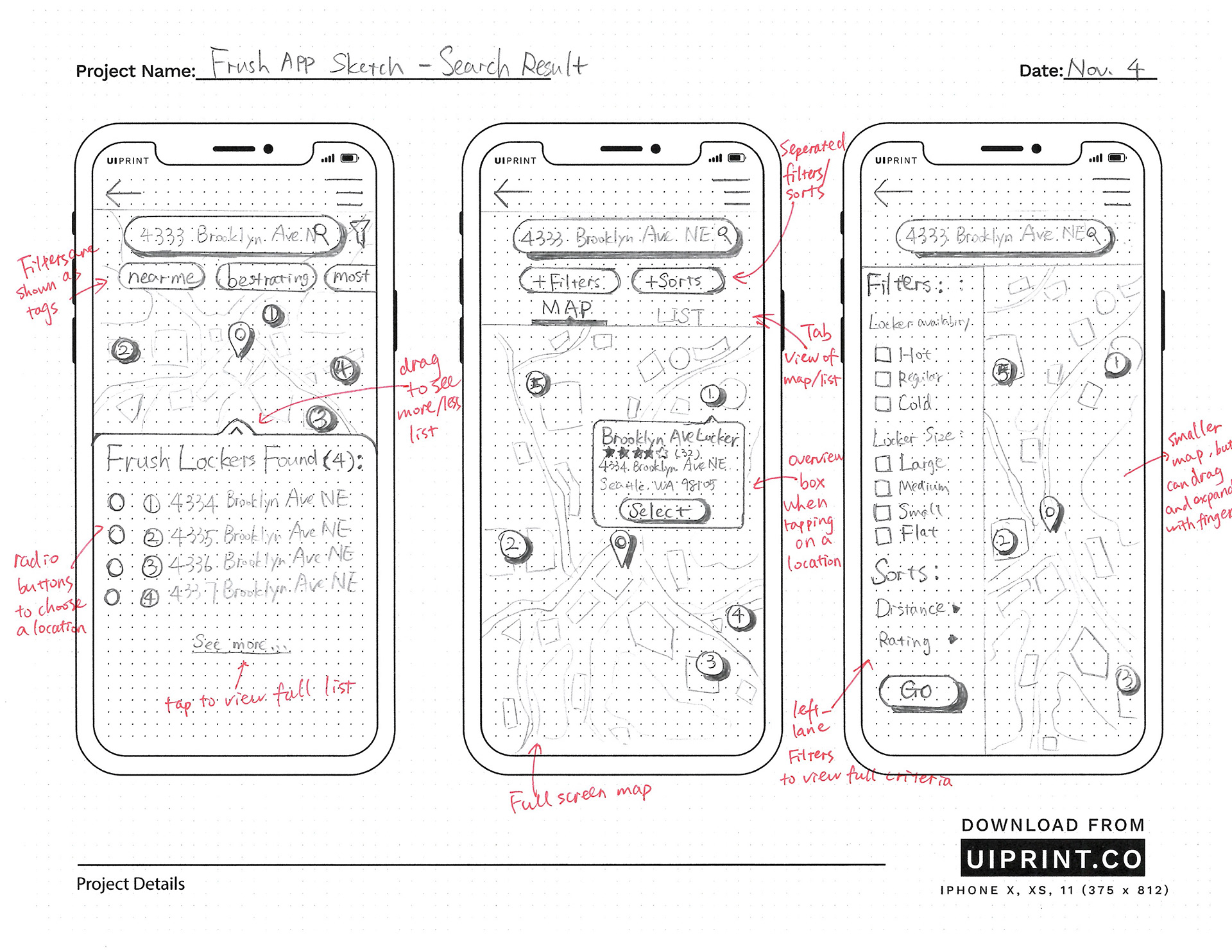
Sketch - Find a locker
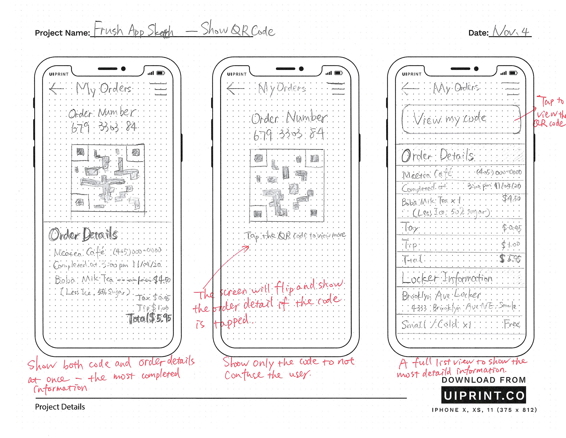
Sketch - Order information
Sitemap
Since Frush looks like an ad-hoc step integrated in the checkout process, I wanted to keep it concise and short, and that's why there were only three steps/pages before confirming the order.
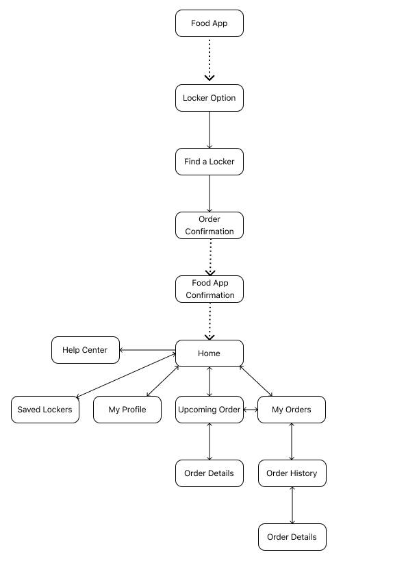
Frush Sitemap
Wireframe
I've created 2 versions of wireframe. In the first version, I created 2 versions for those key screens. The features that I wanted to emphasize on were locker options, locker locations, and order confirmation pages - basically the three steps to achieve the user goal of choosing a right locker for his/her delivery order.
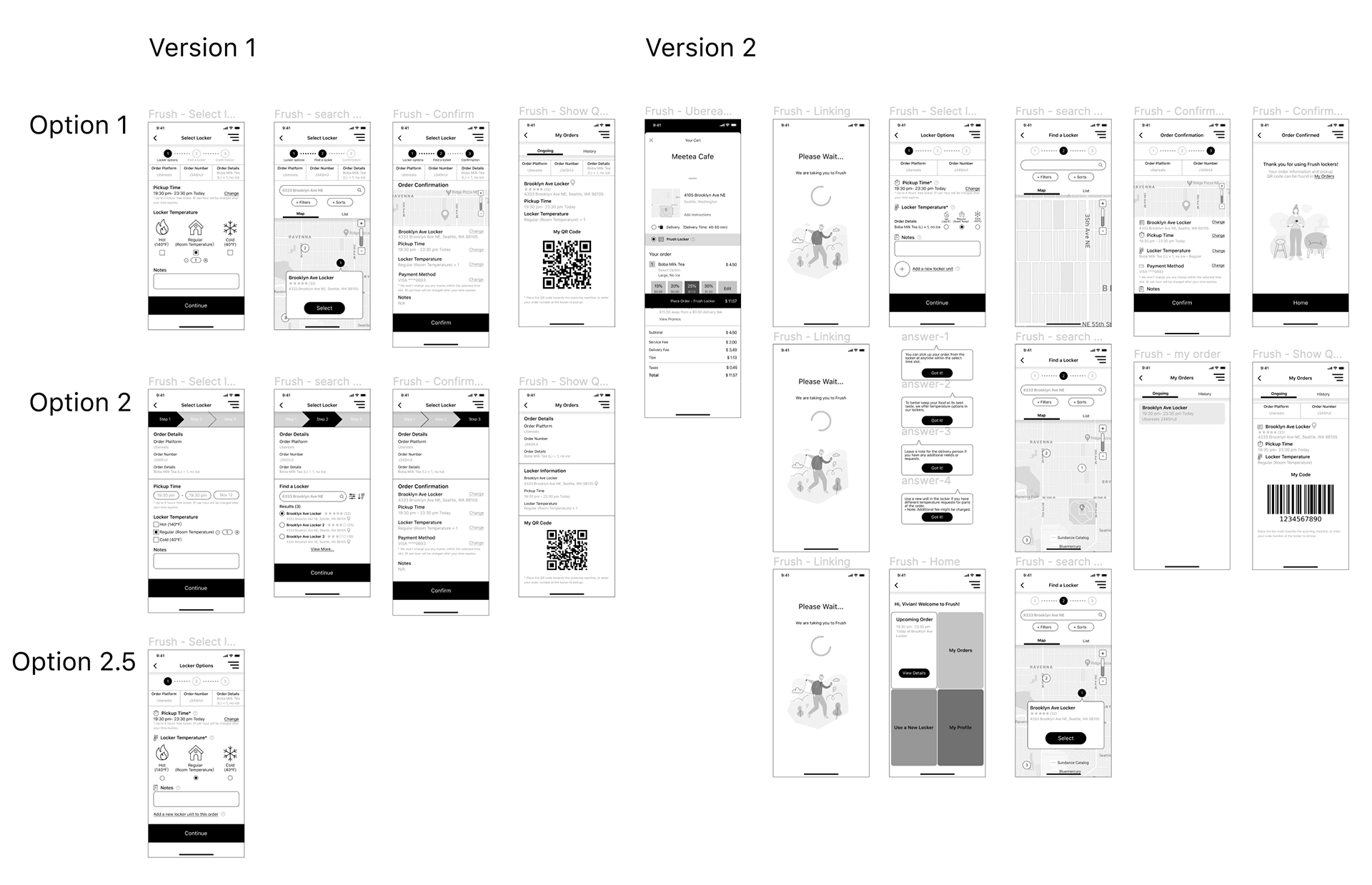
Frush Wireframe
Style Guide
The style guide of Frush follows the moodboard of a fresh and delightful tone, and follows the WCAG guideline of accessibility.

Logo Design
The logo of Frush app is based on the idea of the initial "F" with a barcode inside to show its usage.
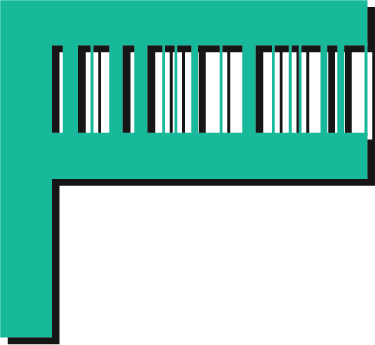
Frush Logo
1.0 Version of Hi-Fi Design
In the first version of Hi-fidelity design, Frush app is activated when a user placed an order on another food delivery app, and by finishing choosing - lacating - confirming, a locker order would be generated, and the user can find the order in Frush app.
Frush App Prototype Version 1.0
But... Can Frush do better than this?
3 usability tests were done with the 1st version of Frush app. The users can all finish the tasks within reasonable time, and they will use the app or recommend it to others under certain circumstances. I got positive feedback on the overall flow and features such as the temperature control of the locker. Also, there is insightful feedback that can be helpful for iterations:
• Some of the users cannot realize that the Frush app is an ad hoc app to any food order apps, and they also hesitated to place the order before selecting a locker, so further instructions on the checkout page is needed.
“I want to know the locker location on the checkout page.” - Richard
“I will check the question symbol beside the Frush locker to get further instructions because I don’t understand what it is.” - Joy
“Is Frush an independent app or it’s embedded? I feel it was linked to Ubereats.” - Yihan
• In step 2 - find a locker, the users could not figure out what to put in the search bar. So some hints should be provided to better inform the users. Also the users did not understand what the “filters” and “sorts” functions were about.
“The location part is confusing. It will be better if there are multiple choices to choose from.” - Joy
“What’s ‘filters’ and ‘sorts’ for? Also I need some hints in the search bar like input address/zip code/….” - Yihan
“I do not know what step 2 means. It’s better to pop up the locker location automatically.” - Richard
• For the pickup order from the locker task, there needs to be notification or indication to show the order’s current status or other ways that can provide assistance for the user via the app.
“I need to know the order status. When should I pick up?” - Yihan
“There should be some support/help functions if I can’t open the locker.” - Joy

Clearer CTA to indicate the next steps and go to Frush before checkout

Hints in the search bar and tags instead of filters
Added order status and changed the navigation bar to focus on main functions of Frush
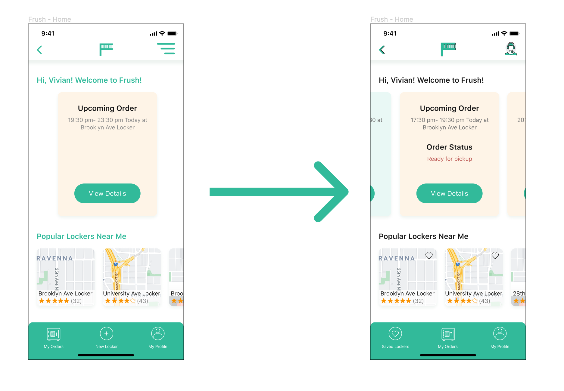
Brand-new Frush App is Here!
And here is the final version of Frush app! Compared to the first version, there is more indicator and help sections since this is a comparatively new service for most users. And after choosing a locker, the user will go back to the delivery app again to confirm the whole order, so it is easier to go back and forth. Also a saved lockers function is built to make it easy to manage locker locations.
Frush App Prototype Version 2.0
A Glance of the Locker's Side
Since I did not designed the experience on the actual locker, here is a glance at how the screen on the locker looks like. After the main screen, the user will scan or enter the code for pickup, and the delivery person will have to choose an appropriate size of the locker and put the food in the locker according to the selected temperature by the user.

Home Screen on Frush Locker

Outcome
Frush locker is an interesting and enjoyable project for me this quarter. Not only because it is closely related to the ongoing pandemic at this point, but also because it developed a brand-new business model that could be applied in our real life. I have learned the importance of truly listening to my users during the process, and the researches and testings helped a lot in my designs. In terms of future steps, here are some that I would like to try next:
• User experience on the locker
• Experience for the delivery person
• User flow of saved locker management